How to Customize Chatbot Appearance
Where to Find Appearance Settings
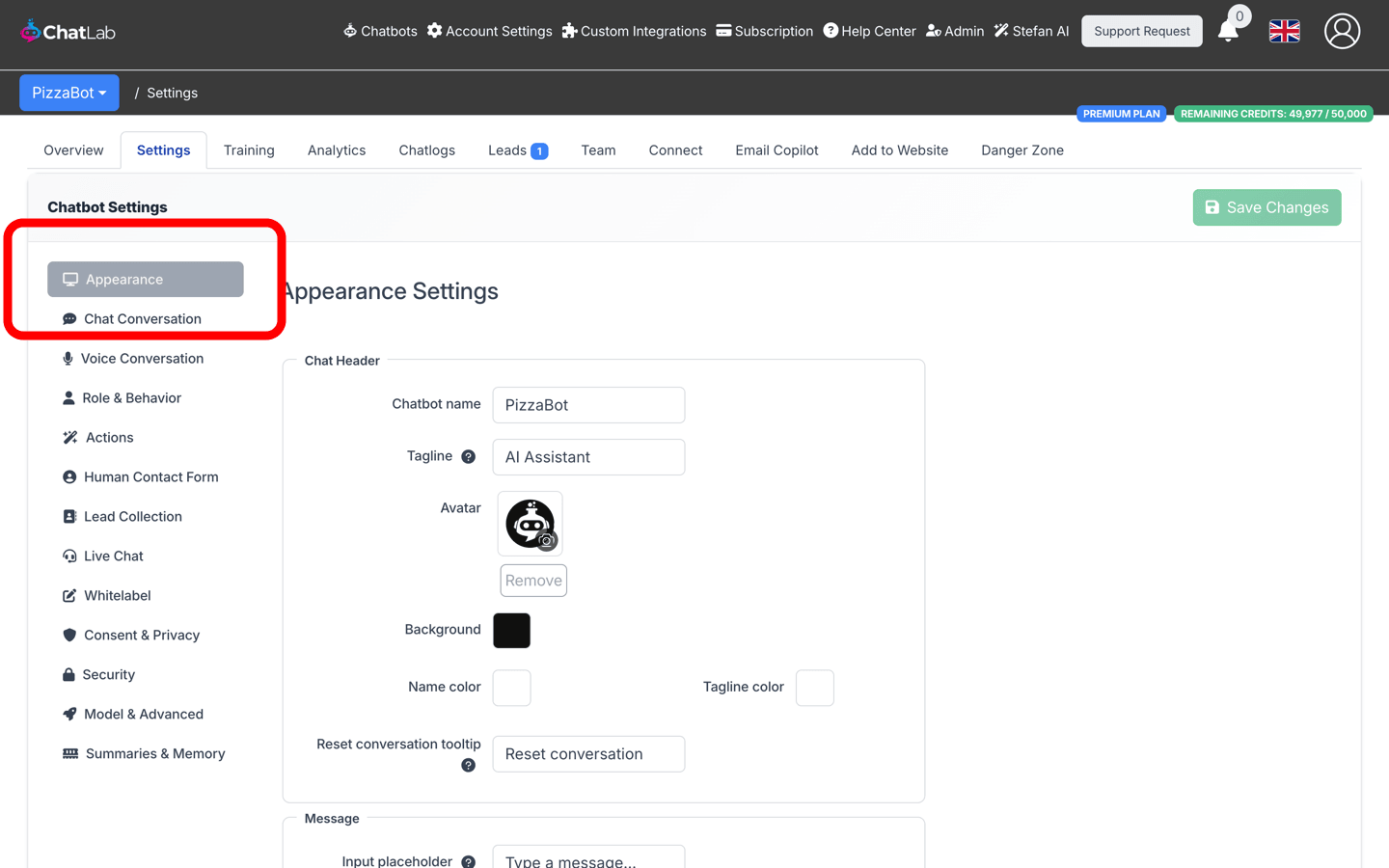
From the main ChatLab administration page, select Chatbots in the main menu, click on the selected chatbot, select the Settings tab and choose Appearance in the left menu.
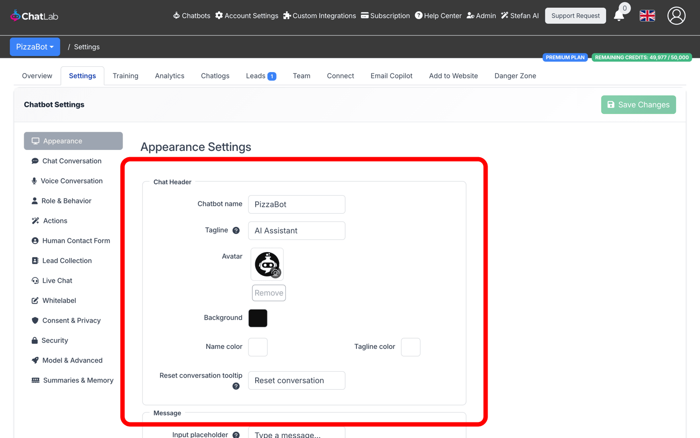
Chat Header
Configure how the top section of your chat widget looks:
- Chatbot name - the display name shown in the chat header (max 60 characters)
- Tagline - optional subtitle displayed below the chatbot name (max 60 characters)
- Avatar - upload a custom image that customers see while interacting with the chatbot
- Background - background color of the header area
- Name color - color of the chatbot name text
- Tagline color - color of the tagline text
- Reset conversation tooltip - tooltip text shown when visitors hover over the reset conversation button in the widget header (max 40 characters, default "Reset conversation")
Message
Customize the message input and the look of conversation messages:
- Input placeholder - placeholder text shown in the new-message input field at the bottom of the widget (max 50 characters, default "Type a message..."). Use it to encourage visitors to start typing. This setting was previously located on the Conversation Settings page (called "Placeholder for new message") and has been moved here.
- User background - background color of messages sent by the visitor
- User text - text color of visitor messages
- Resp. background - background color of chatbot responses
- Response text - text color of chatbot responses
- Font size - size of message text (12-24 px)
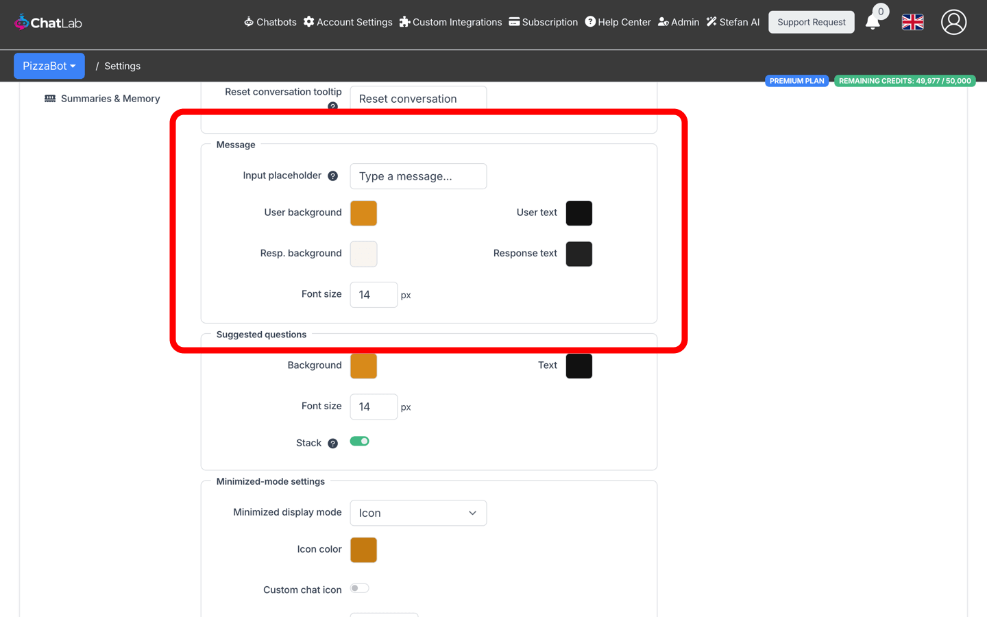
Suggested Questions
Style the suggested question buttons that appear in the chat:
- Background - background color of suggested question buttons
- Text - text color of suggested question buttons
- Font size - size of suggested questions text (12-24 px)
- Stack - when enabled, longer suggested questions stack vertically instead of showing a horizontal scrollbar
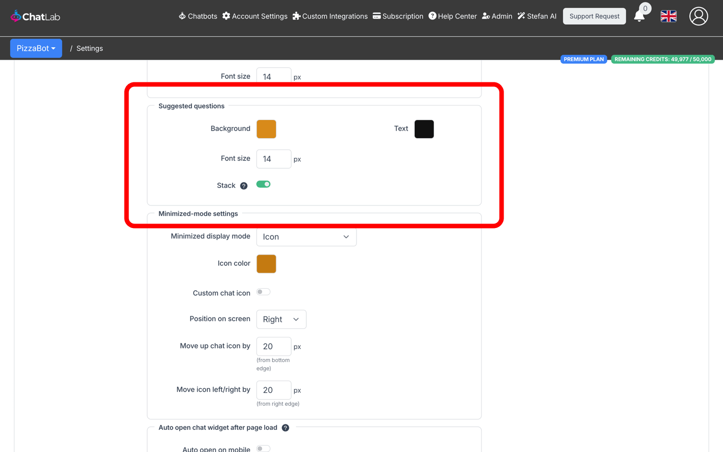
Minimized-Mode Settings
Control how the chat widget appears when minimized (before the user opens the chat):
- Minimized display mode - choose between:
- Icon - standard circular chat launcher icon (default)
- Minified chat bar - compact text input bar displayed at the bottom of the page
- Icon color / Mini bar color - color of the launcher icon or mini bar background
- Custom chat icon (icon mode only) - enable to upload custom open/close chat icons
- Position on screen - place the widget on the left or right side of the screen
- Move up chat icon/bar by - vertical offset in pixels from the bottom edge
- Move icon/bar left/right by - horizontal offset in pixels from the nearest screen edge
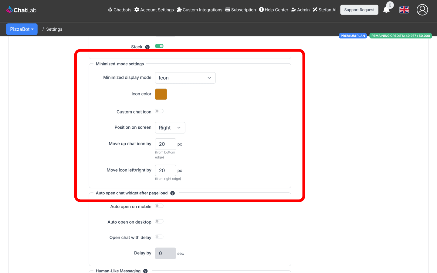
Auto Open Chat Widget After Page Load
Configure the chat to automatically expand when visitors load the page:
- Auto open on mobile - automatically opens the chat on mobile devices
- Auto open on desktop - automatically opens the chat on desktop screens
- Open chat with delay - enables a delay before auto-opening (only available when auto open is enabled)
- Delay by - number of seconds to wait before opening (0-60 seconds)
Human-Like Messaging
Simulates human-like typing by splitting responses into multiple message bubbles, shown gradually sentence by sentence:
- Human-Like Messaging - toggle to enable/disable the feature
- Delay Between Bubbles - time in seconds between displaying each message bubble (0-200 seconds)
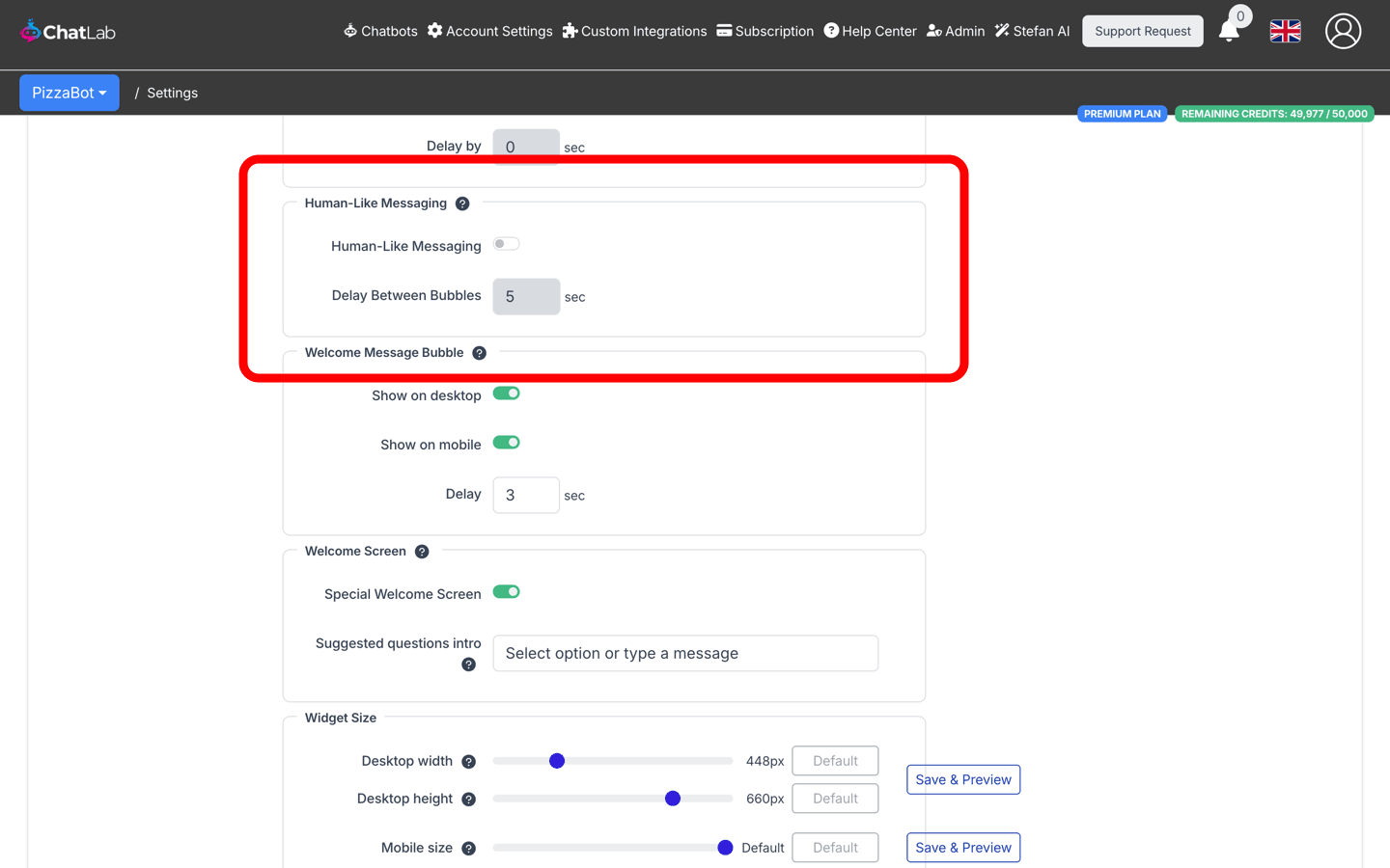
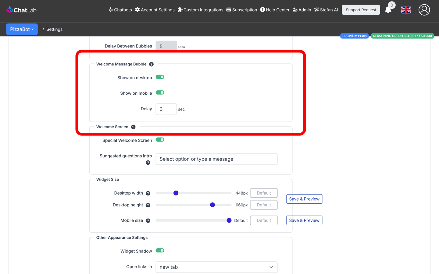
Welcome Message Bubble
Display the welcome message in a bubble above the chat launcher icon to help visitors notice the chat. This feature is only available in icon mode and does not work in iframe mode or when auto-open is enabled.
- Show on desktop - display the welcome message bubble on desktop
- Show on mobile - display the welcome message bubble on mobile devices
- Delay - number of seconds after page load before showing the bubble (0-60 seconds)
If you have multiple welcome messages, they will appear stacked above the chat icon.
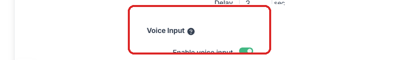
Voice Input
Allow users to interact with the chatbot using their voice. This feature uses the Web Speech API, supported in most modern browsers and devices. The voice input language is determined by the browser's and device's language settings.
- Enable voice input - toggle to show/hide the microphone button in the chat input area
Welcome Screen
Switch the widget into a special opening layout that greets new visitors with a large welcome message and the suggested questions stacked on a centered white card. The welcome screen only appears at the start of a new session and transitions to the standard chat view as soon as the visitor sends their first message.
- Special Welcome Screen - turns the welcome screen mode on or off (off by default)
- Suggested questions intro - short label shown above the suggested questions card on the welcome screen (for example, "Select an option or type a message"). Leave empty to hide the label. Requires suggested questions to be configured in Settings > Conversation.
The welcome screen also integrates with Lead Collection and Privacy Policy consent - if either is required at conversation start, the form or consent prompt is shown on the welcome card instead of the suggested questions.
For full details, layout variants and visitor-side screenshots, see Welcome Screen.
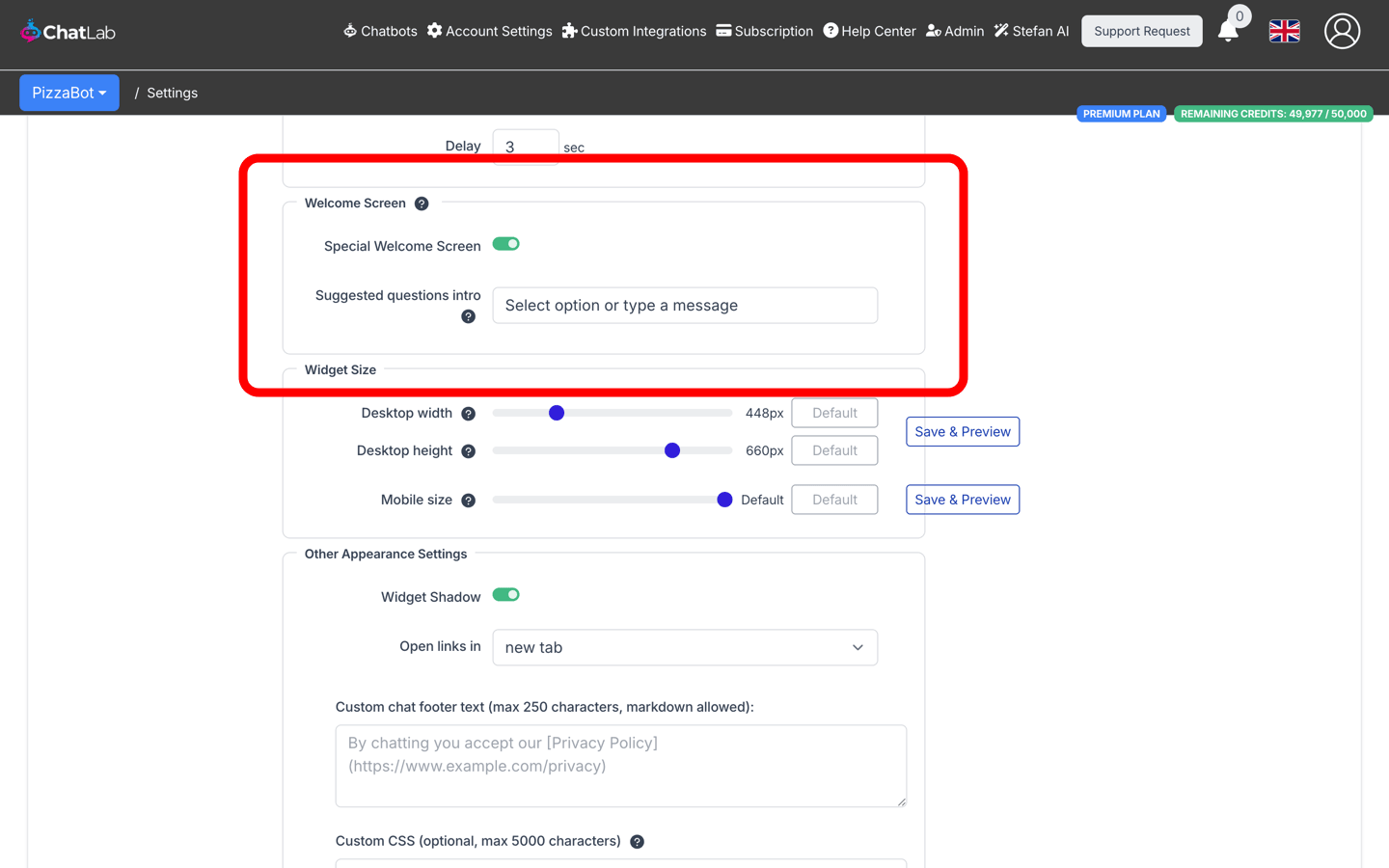
Widget Size
Adjust how large the open chat widget appears on desktop and mobile devices. Each slider has a Default button that restores the built-in sizing.
- Desktop width - widget width on desktop browsers, in pixels (330-800, default 448)
- Desktop height - widget height on desktop browsers, in pixels (300-770, default 660)
- Mobile size - widget size on mobile devices, as a percentage of the screen (60-100%, default 100%)
At the default value, the widget uses ChatLab's built-in responsive sizing. Any other value applies a fixed size.
On mobile, the default value (100%) makes the open chat cover the entire screen. Choosing a lower percentage shrinks the widget to that portion of the screen and centers it on the viewport, so visitors can still see the page around the chat.
Save & Preview
Next to the sliders you will find two Save & Preview buttons - one for the desktop rows and one for the mobile row. Clicking a button saves any unsaved changes and then opens the chat in a preview window using your current settings:
- The desktop button opens a regular browser window so you can see the exact size on a desktop screen.
- The mobile button opens a compact popup (400 x 700) so the widget renders in its mobile layout, which is useful when you're tuning the Mobile size slider from a desktop computer.
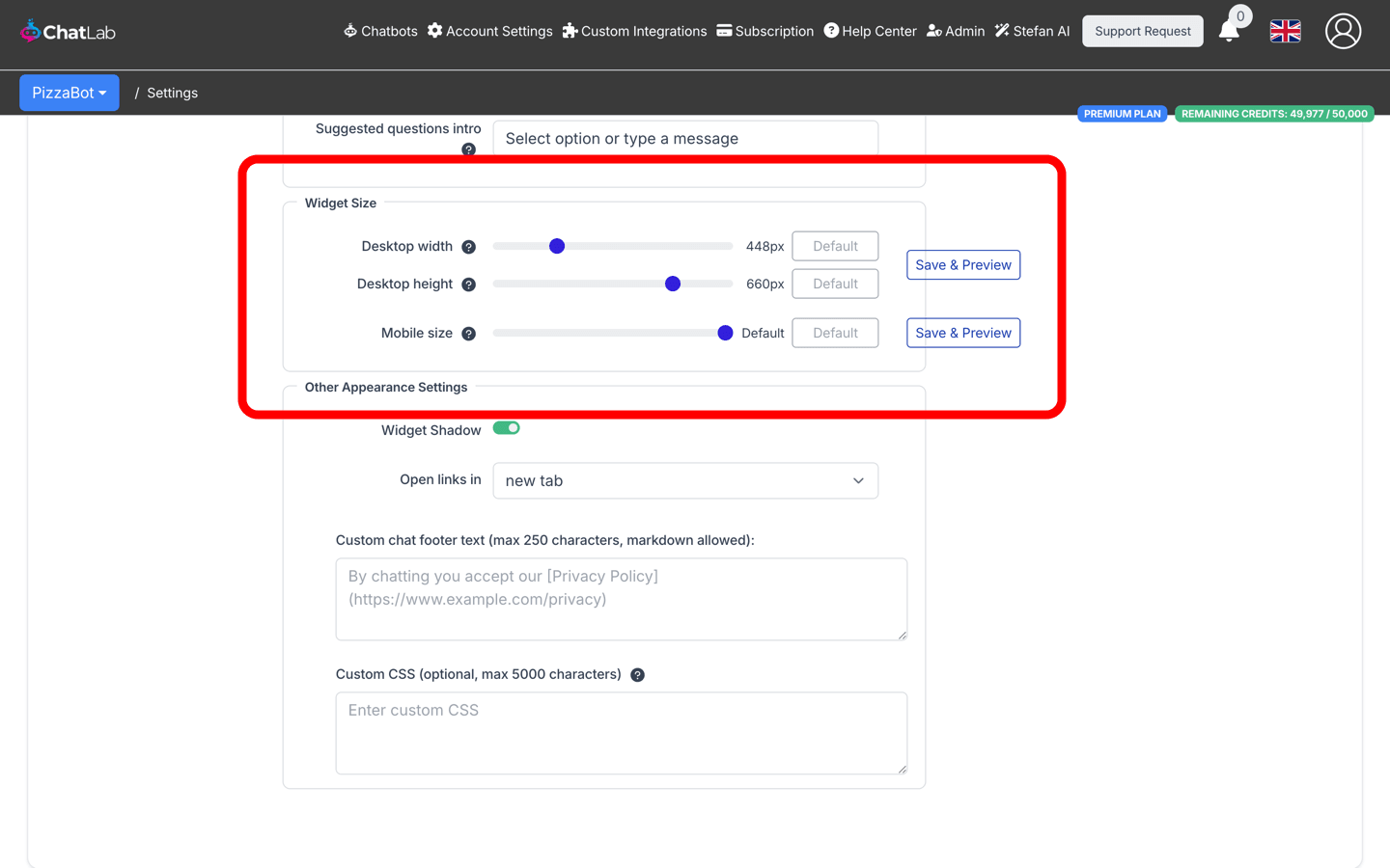
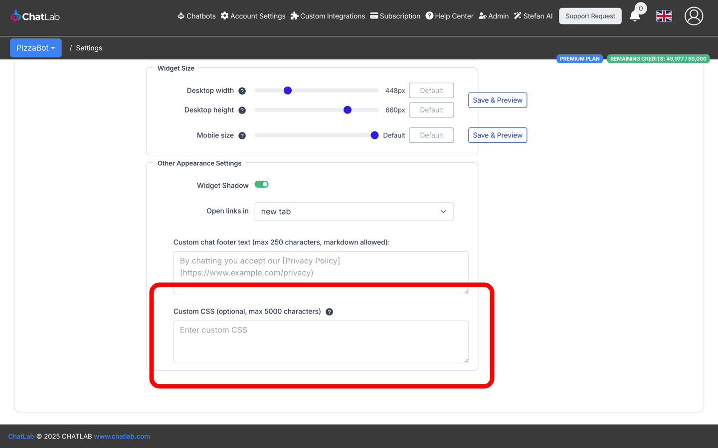
Other Appearance Settings
- Widget Shadow - enable or disable a shadow around the chat widget container
- Open links in - choose whether links in chat messages open in a new tab or the same tab
A close (X) button is now also shown in the chat header on desktop, so visitors can collapse the chat back to the launcher without reloading the page. The close button stays hidden when the chat is embedded as an iframe or in fullscreen mode.
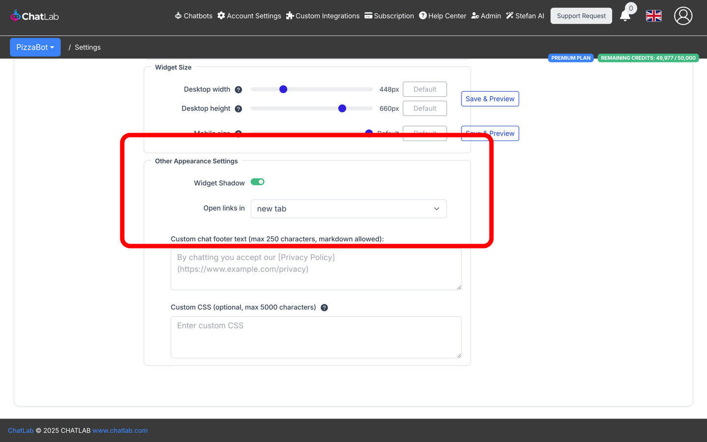
Custom Chat Footer
Add custom text displayed at the bottom of the chat widget (max 250 characters). Markdown is supported for inserting links. Common use: linking to your privacy policy or terms of service.
Example markdown:
By chatting you accept our [Privacy Policy](https://www.example.com)
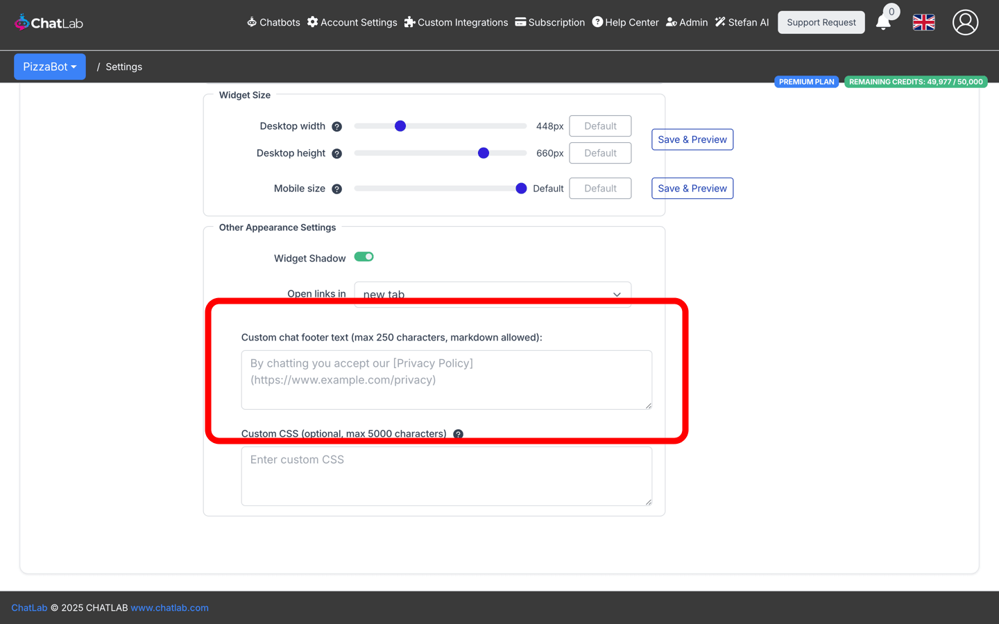
Custom CSS
Add custom CSS styles to further customize the look of your chat widget (max 5000 characters):