Appearance settings control how your chatbot's chat widget looks to visitors on your website - the header, the colors and fonts of messages, the launcher icon, the welcome screen, the widget size and more. This is where you make the widget match your brand.
You need a chatbot before you can style it. If you have not created one yet, start with How to create your first chatbot.
Where to Find Appearance Settings
Select your chatbot and navigate to Settings > Appearance. From the main ChatLab page click Chatbots, open your chatbot, open the Settings tab, then choose Appearance in the left menu.
A live preview of your widget appears on the right side of the page and updates as you change settings.
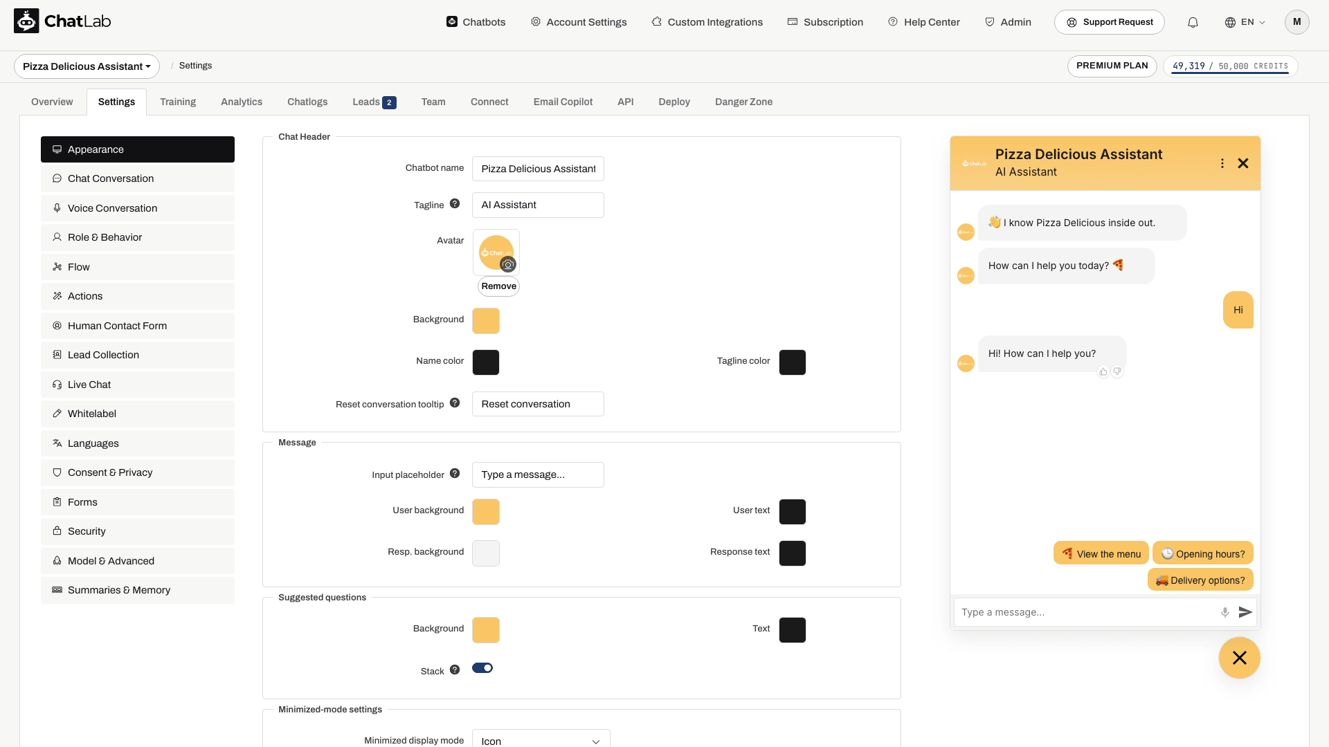
Chat Header
Configure how the top section of your chat widget looks:
- Chatbot name - the display name shown in the chat header (max 60 characters)
- Tagline - optional subtitle displayed below the chatbot name (max 60 characters)
- Avatar - upload a custom image that customers see while interacting with the chatbot. Use the Remove button (highlighted below) to clear the current image.
- Background - background color of the header area
- Name color - color of the chatbot name text
- Tagline color - color of the tagline text
- Reset conversation tooltip - tooltip text shown when visitors hover over the reset conversation button in the widget header (max 40 characters, default "Reset conversation")
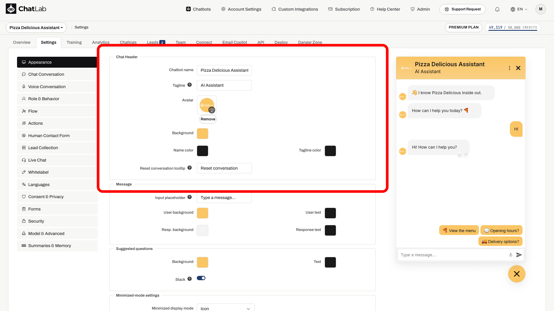
Message
Customize the message input and the look of conversation messages:
- Input placeholder - placeholder text shown in the new-message input field at the bottom of the widget (max 50 characters, default "Type a message..."). Use it to encourage visitors to start typing.
- User background - background color of messages sent by the visitor
- User text - text color of visitor messages
- Resp. background - background color of chatbot responses
- Response text - text color of chatbot responses
Message text size is set in the Typography section, together with the widget font.

Suggested Questions
Suggested questions are the ready-made prompts a visitor can tap to start a conversation. You write the questions themselves in Settings > Chat Conversation; here you style how the buttons look:
- Background - background color of suggested question buttons
- Text - text color of suggested question buttons
- Stack - when enabled, longer suggested questions stack vertically instead of showing a horizontal scrollbar
Suggested questions text size is set in the Typography section.

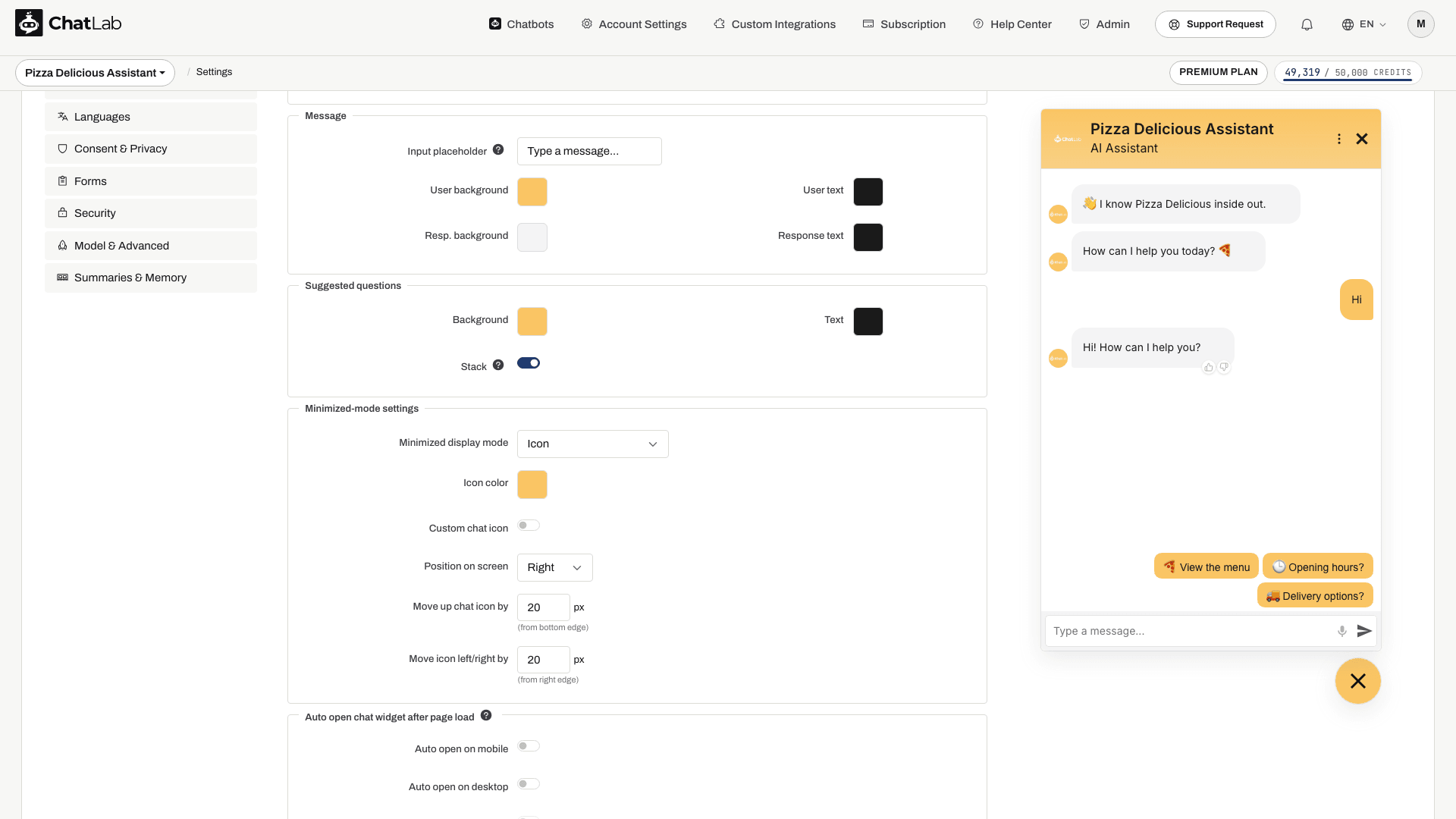
Minimized-Mode Settings
Control how the chat widget appears when minimized (before the visitor opens the chat):
- Minimized display mode - choose between:
- Icon - standard circular chat launcher icon (default)
- Minified chat bar - compact text input bar displayed at the bottom of the page
- Icon with text - a wider pill-shaped launcher: the icon plus a short two-line caption
- Icon color / Mini bar color - color of the launcher icon or mini bar background
- Custom chat icon (icon mode only) - enable to upload custom open/close chat icons
- Position on screen - place the widget on the left or right side of the screen
- Move up chat icon/bar by - vertical offset in pixels from the bottom edge
- Move icon/bar left/right by - horizontal offset in pixels from the nearest screen edge
Icon with Text
The Icon with text mode gives the launcher a short caption, so visitors can see what the chat is for before they open it. It is useful when a bare icon is not obvious enough - for example "Write to us / We reply right away" or "Need help? / Ask our assistant".
Choosing this mode adds four settings:
- Label line 1 - the first, stronger line of the caption (max 60 characters)
- Label line 2 - the second, lighter line (max 60 characters). Leave it empty for a single-line launcher
- Text color - color of the caption. Leave it untouched and ChatLab picks black or white automatically, based on how light or dark your launcher color is
- Show close cross - adds a small cross to the launcher so visitors can hide it
Both lines are shortened with an ellipsis if they do not fit, so the launcher never grows wider than the screen. The launcher collapses back to a circle while the chat is open.
If multi-language support is enabled, both caption lines are translated like the rest of the visitor-facing texts.
Show close cross is off by default and is available only in this mode. When enabled, a visitor who clicks the cross hides the launcher for the rest of their browsing session - it stays hidden as they move between pages and comes back on their next visit or in a new tab. A chatbot set to open automatically respects that choice and will not reopen after the visitor has dismissed it.

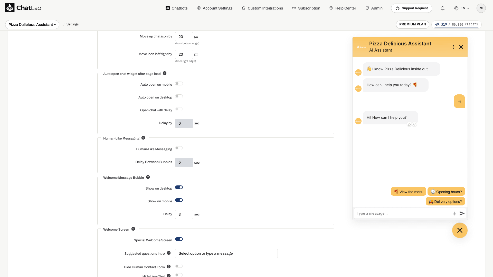
Auto Open Chat Widget After Page Load
Configure the chat to automatically expand when visitors load the page:
- Auto open on mobile - automatically opens the chat on mobile devices
- Auto open on desktop - automatically opens the chat on desktop screens
- Open chat with delay - enables a delay before auto-opening (only available when auto open is enabled)
- Delay by - number of seconds to wait before opening (0-60 seconds)
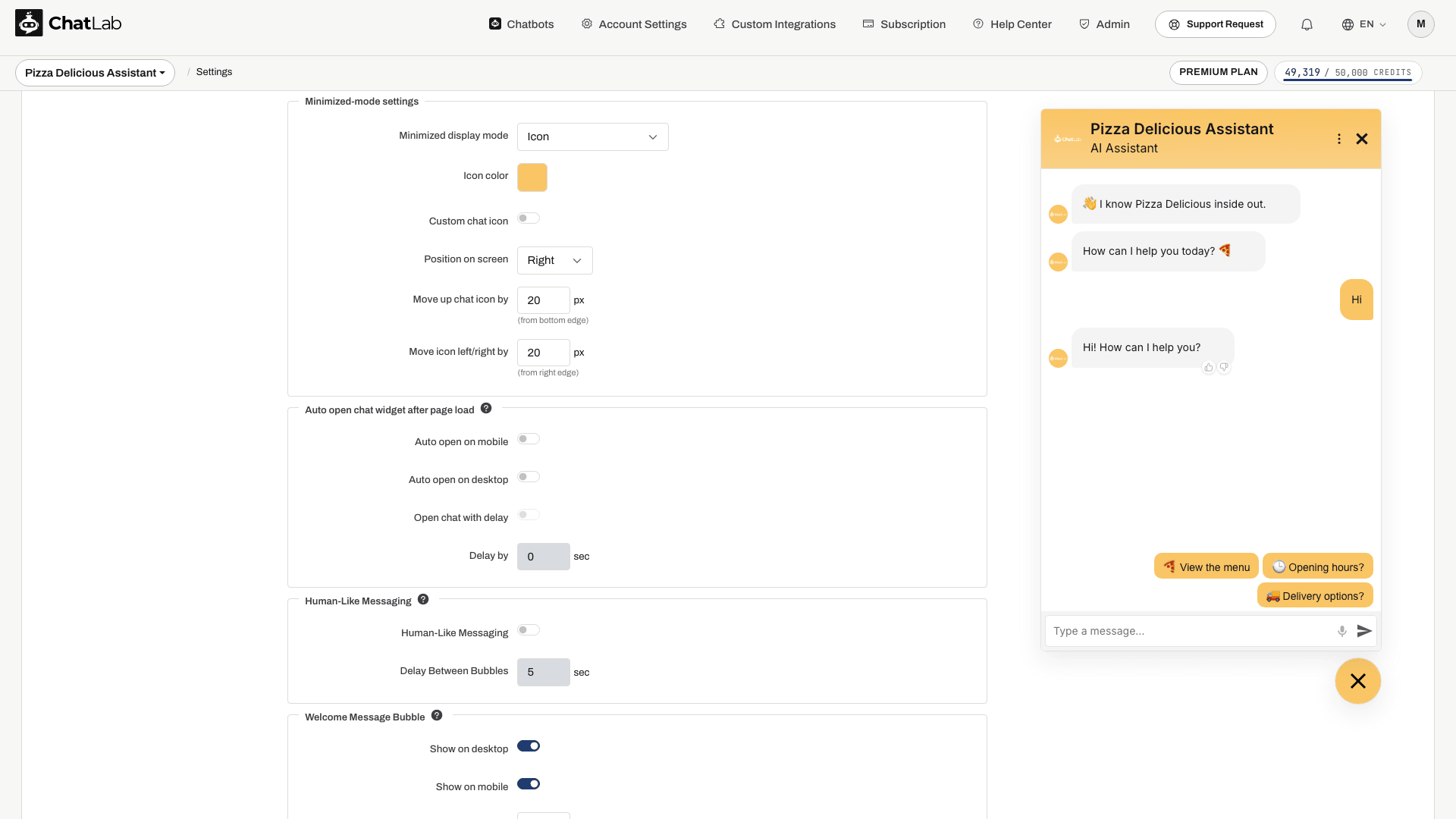
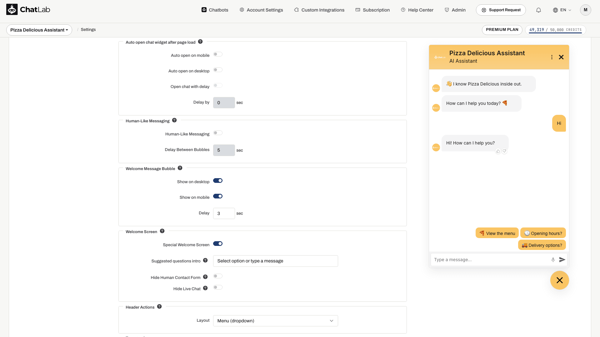
Human-Like Messaging
Simulates human-like typing by splitting responses into multiple message bubbles, shown gradually sentence by sentence:
- Human-Like Messaging - toggle to enable/disable the feature
- Delay Between Bubbles - time in seconds between displaying each message bubble (0-200 seconds)
Welcome Message Bubble
Display the welcome message in a bubble above the chat launcher icon to help visitors notice the chat. This feature is only available in icon mode and does not work in iframe mode or when auto-open is enabled.
- Show on desktop - display the welcome message bubble on desktop
- Show on mobile - display the welcome message bubble on mobile devices
- Delay - number of seconds after page load before showing the bubble (0-60 seconds)
If you have multiple welcome messages, they will appear stacked above the chat icon.
Voice input (the microphone button in the chat input area) is configured in Settings > Chat Conversation, not here in Appearance.
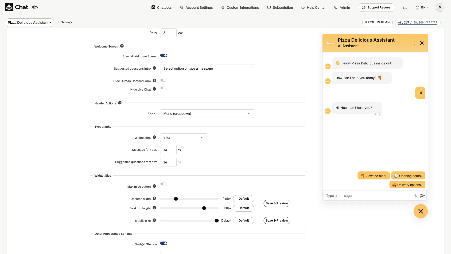
Welcome Screen
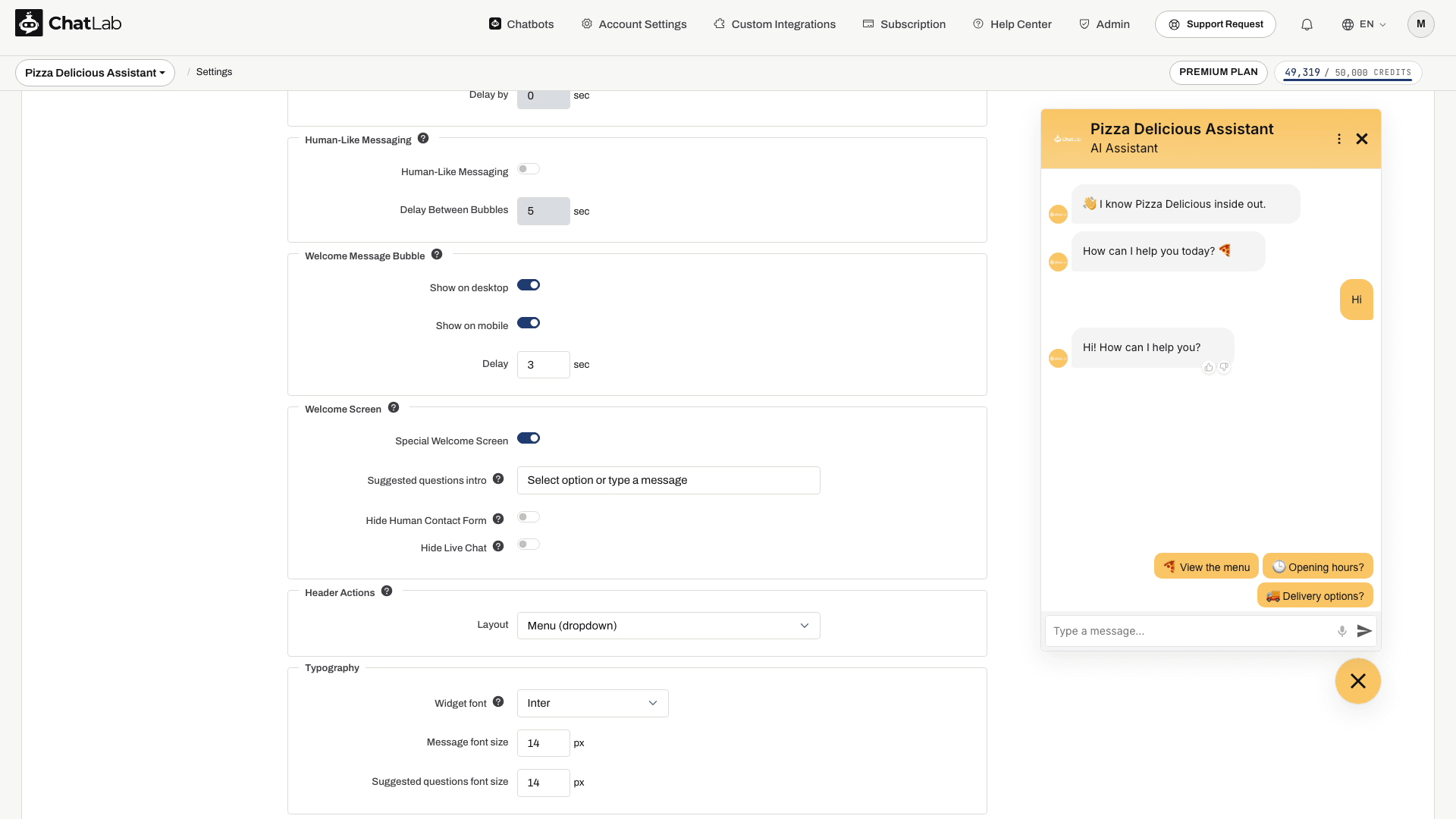
Switch the widget into a special opening layout that greets new visitors with a large welcome message and the suggested questions stacked on a centered white card. The welcome screen only appears at the start of a new session and transitions to the standard chat view as soon as the visitor sends their first message.
- Special Welcome Screen - turns the welcome screen mode on or off (off by default)
- Suggested questions intro - short label shown above the suggested questions card on the welcome screen (for example, "Select an option or type a message"). Leave empty to hide the label. Requires suggested questions to be configured in Settings > Chat Conversation.
- Hide Human Contact Form - hides the contact form action in the header while the welcome screen is showing
- Hide Live Chat - hides the live chat action in the header while the welcome screen is showing
The welcome screen also integrates with Lead Collection and Privacy Policy consent - if either is required at conversation start, the form or consent prompt is shown on the welcome card instead of the suggested questions.
For full details, layout variants and visitor-side screenshots, see Welcome Screen.
Header Actions
Controls how Live Chat and the Human Contact Form are offered in the chat widget header.
- Separate icons - each action gets its own icon in the header, next to the close button
- Menu (dropdown) - both actions move into the header menu (the three-dot icon), alongside entries like "Reset conversation" and the language switcher when those are enabled
New chatbots use the menu, which keeps the header uncluttered as more actions are added. Chatbots created before 2 September 2026 keep separate icons, so nothing changes for their visitors. Switch at any time - the setting only affects presentation, not what the actions do.
Typography
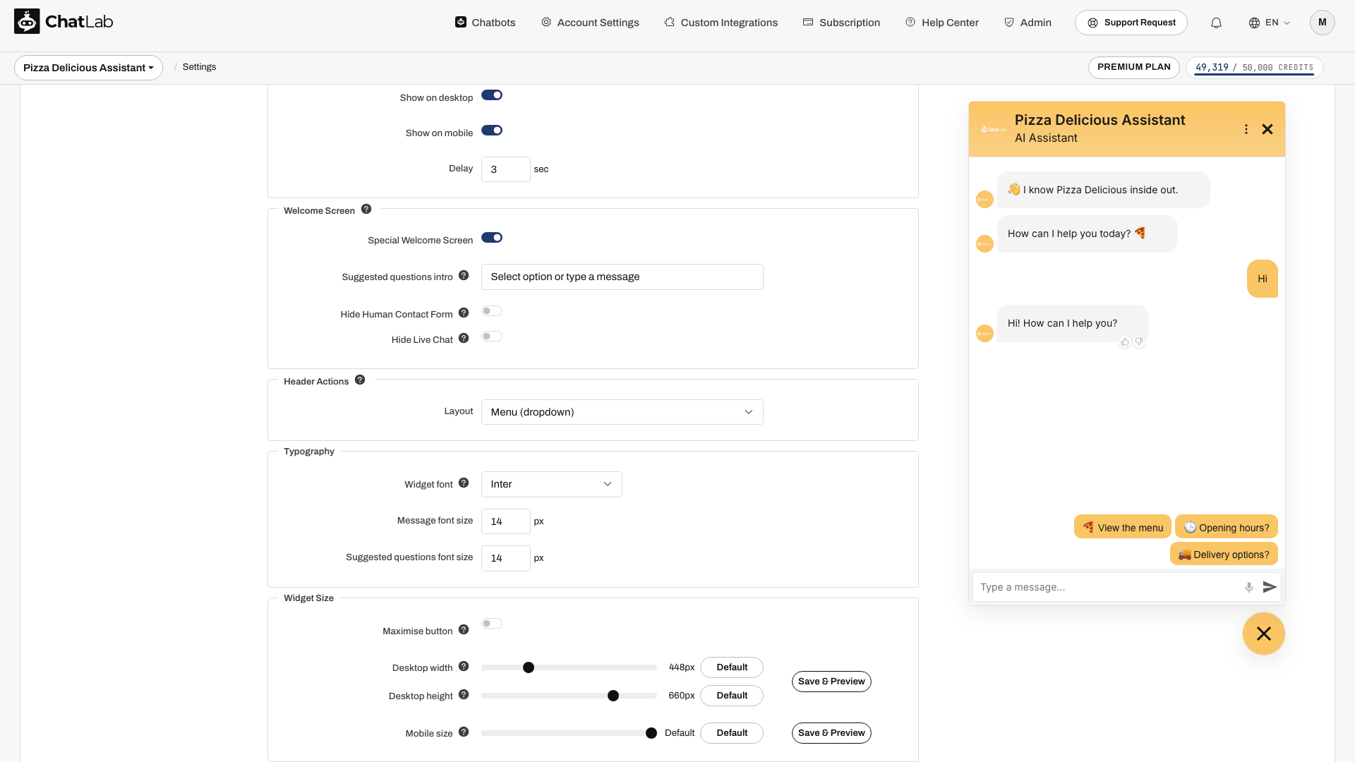
Sets the typeface and the text sizes used across the whole widget - messages, suggested questions, header, forms and the launcher caption.
- Widget font - one of eight typefaces: System default, Inter, Nunito, Lato, Montserrat, Poppins, Source Serif and JetBrains Mono
- Message font size - size of message text (12-24 px)
- Suggested questions font size - size of the suggested question buttons (12-24 px)
Inter is the default and matches how every chatbot looked before this setting existed, so nothing changes until you pick another font.
System default downloads nothing at all - the widget uses the font already installed on the visitor's device. That makes it the fastest option, and it blends into sites that use the system typeface themselves, but the chat will look slightly different on Windows, macOS and Android. The other seven are Google Fonts, downloaded once by the visitor's browser. Each one has a fallback, so if a visitor's network blocks Google Fonts the text stays readable and the layout does not break.
The font file is fetched into the chat window itself. It is added to your own page only when the widget shows text outside the chat window - the Icon with text launcher, the minified chat bar, or welcome message bubbles. A chatbot using the plain icon launcher adds no extra request to your page.
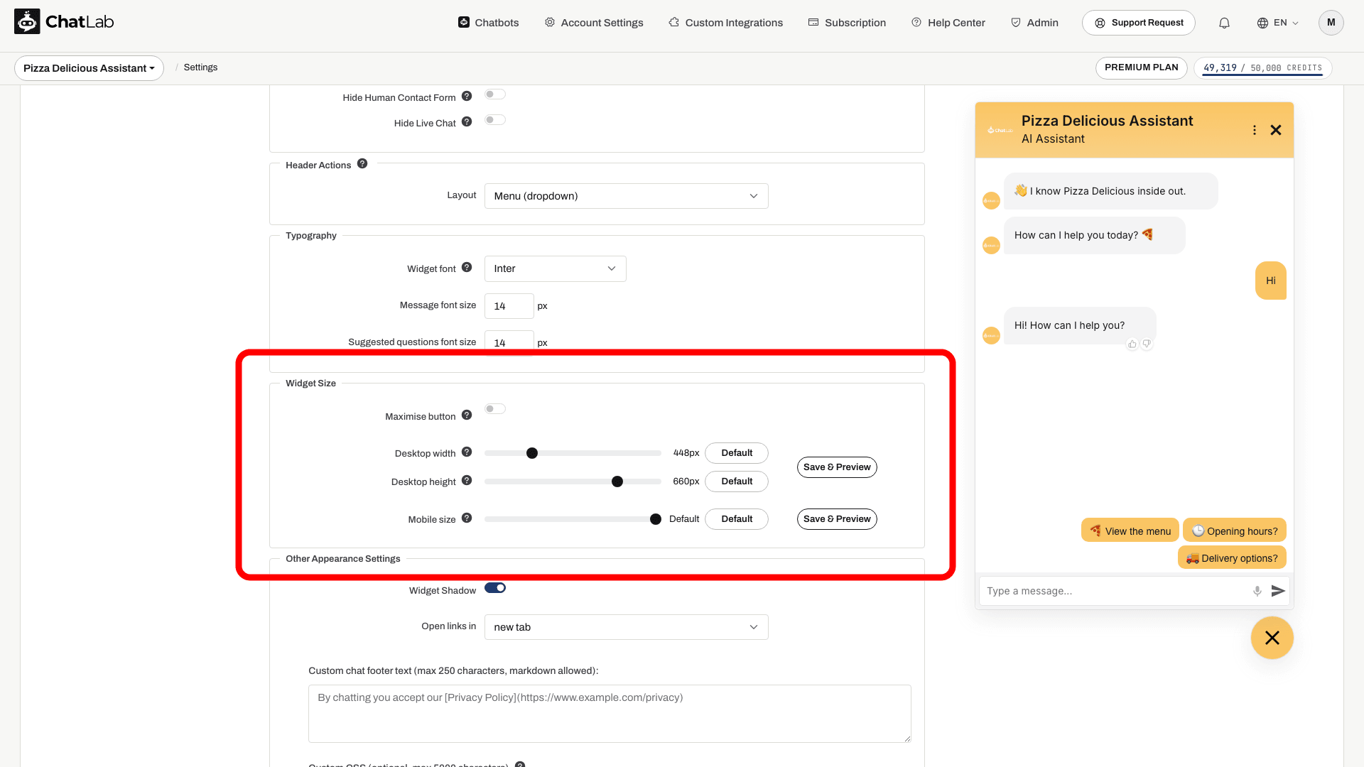
Widget Size
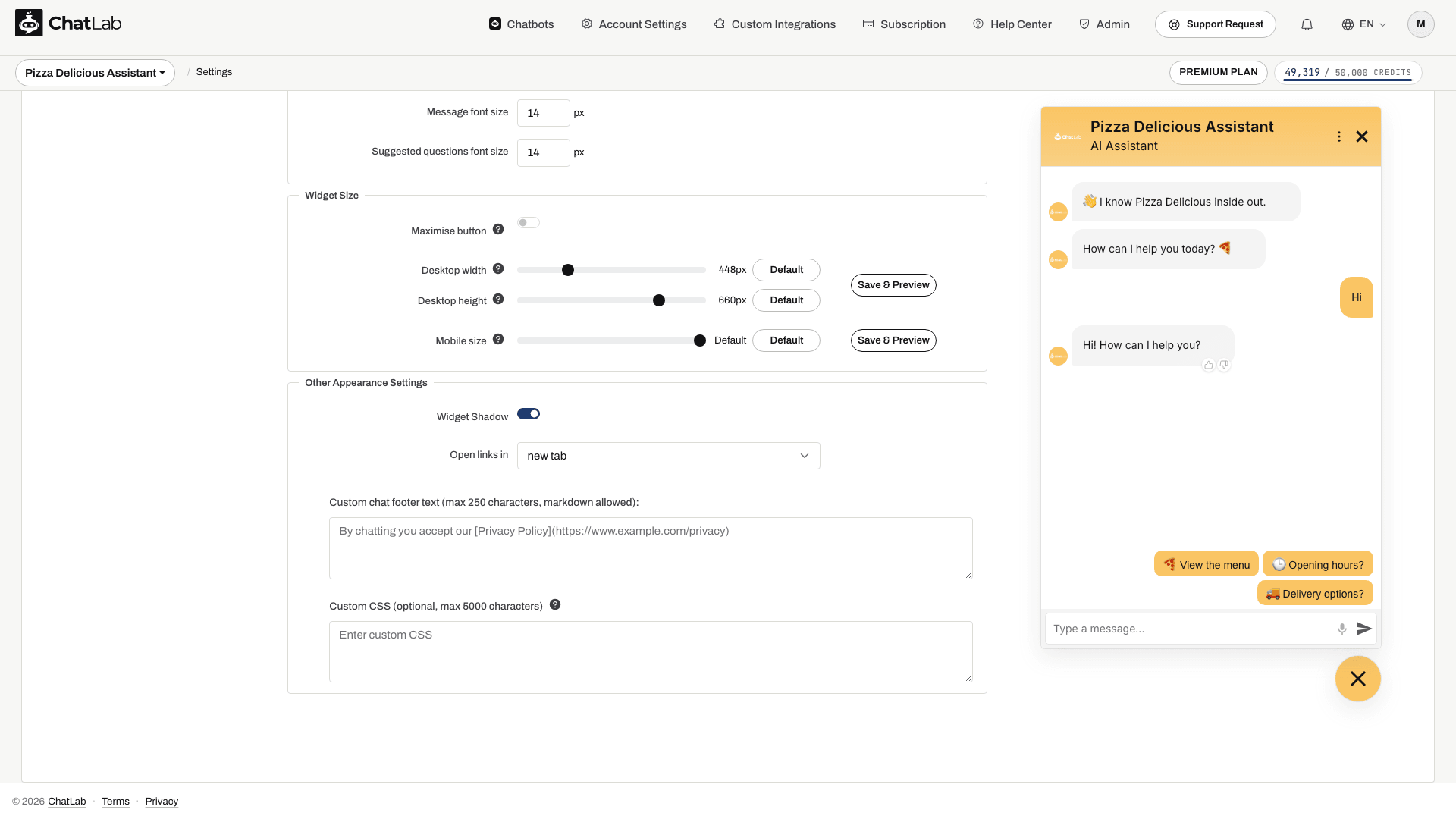
Adjust how large the open chat widget appears on desktop and mobile devices. Each slider has a Default button that restores the built-in sizing.
- Desktop width - widget width on desktop browsers, in pixels (330-800, default 448)
- Desktop height - widget height on desktop browsers, in pixels (300-770, default 660)
- Mobile size - widget size on mobile devices, as a percentage of the screen (60-100%, default 100%)
At the default value, the widget uses ChatLab's built-in responsive sizing. Any other value applies a fixed size.
On mobile, the default value (100%) makes the open chat cover the entire screen. Choosing a lower percentage shrinks the widget to that portion of the screen and centers it on the viewport, so visitors can still see the page around the chat.
Next to the sliders you will find two Save & Preview buttons (highlighted below) - one for the desktop rows and one for the mobile row. Clicking a button saves any unsaved changes and then opens the chat in a preview window using your current settings:
- The desktop button opens a regular browser window so you can see the exact size on a desktop screen.
- The mobile button opens a compact popup (400 x 700) so the widget renders in its mobile layout, which is useful when you are tuning the Mobile size slider from a desktop computer.
Maximise Button (Drawer Mode)
Drawer mode lets the visitor switch the chat from a floating window into a full-height panel docked to the edge of the screen, with your page still visible beside it. It suits conversations the visitor works through while reading the page - long answers, product comparisons, forms, or anything with a lot of text.
Enable Maximise button in Widget Size and a button appears in the chat header; the visitor decides whether to use it. Their choice is remembered for the rest of the browsing session.
- The panel is half the browser window wide, up to 720 px, and always full height. It docks to the same side as your launcher, so a widget positioned on the left opens a drawer on the left.
- Desktop width and Desktop height do not apply here - they size the normal floating window only.
- The button is shown only on desktop screens at least 1200 px wide, with a mouse. On phones and tablets it never appears, because the chat already fills the screen there. If a visitor shrinks the browser below that width, the drawer folds back into the normal window.
- The launcher is hidden while the drawer is open; the visitor closes it from the header, or leaves drawer mode with the same button.
Drawer mode is off by default, so nothing changes for your visitors until you enable it.

Other Appearance Settings
- Widget Shadow - enable or disable a shadow around the chat widget container
- Open links in - choose whether links in chat messages open in a new tab or the same tab
A close (X) button is also shown in the chat header on desktop, so visitors can collapse the chat back to the launcher without reloading the page. The close button stays hidden when the chat is embedded as an iframe or in fullscreen mode.
Custom Chat Footer
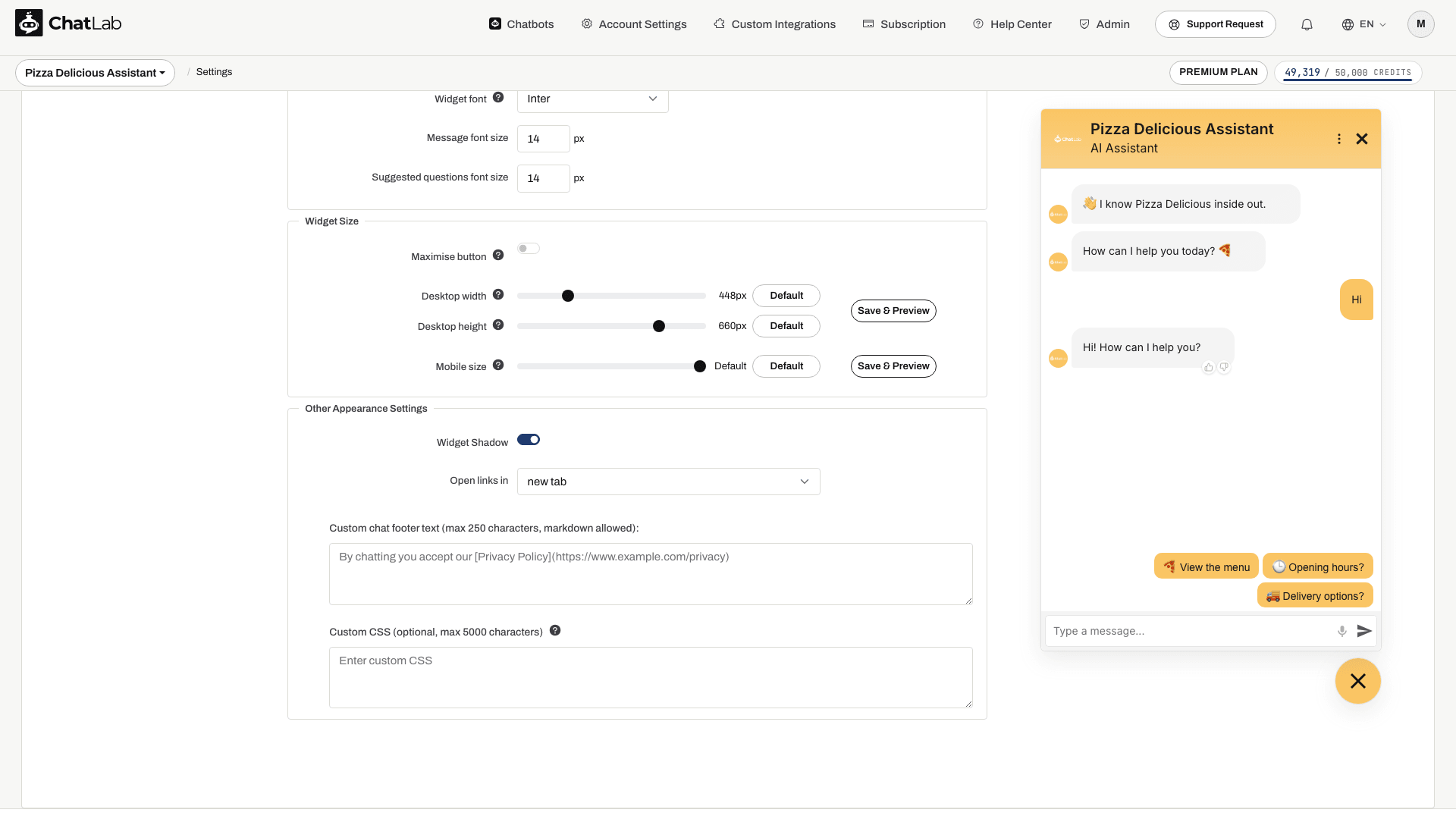
Add custom text displayed at the bottom of the chat widget (max 250 characters). Markdown is supported for inserting links. A common use is linking to your privacy policy or terms of service.
Example markdown:
By chatting you accept our [Privacy Policy](https://www.example.com)
Custom CSS
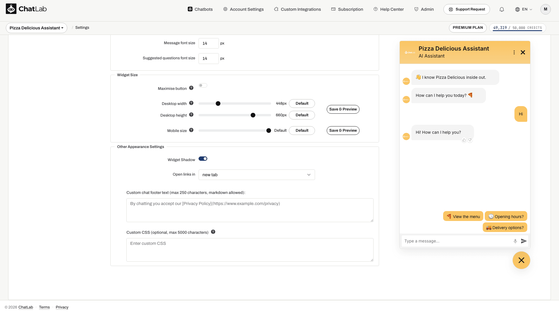
Add custom CSS styles to further customize the look of your chat widget (max 5000 characters):
Related Articles
Changes save automatically. Wait for Saved, then check Overview and the embedded widget on desktop and mobile. The settings preview shows the chat window; launcher placement and page-level auto-open behavior should also be checked on your website embed.
- How to create your first chatbot
- Conversation settings - write the welcome message and suggested questions
- Welcome Screen - the full-screen opening layout and its visitor-side variants
- Custom forms - collect visitor details inside the chat
- Lead collection