Conversation settings control how your chatbot interacts with visitors - from the first welcome message to follow-up suggestions and feedback collection.
Where to find conversation settings
Select your chatbot, click the Settings tab, then select Conversation in the left sidebar.
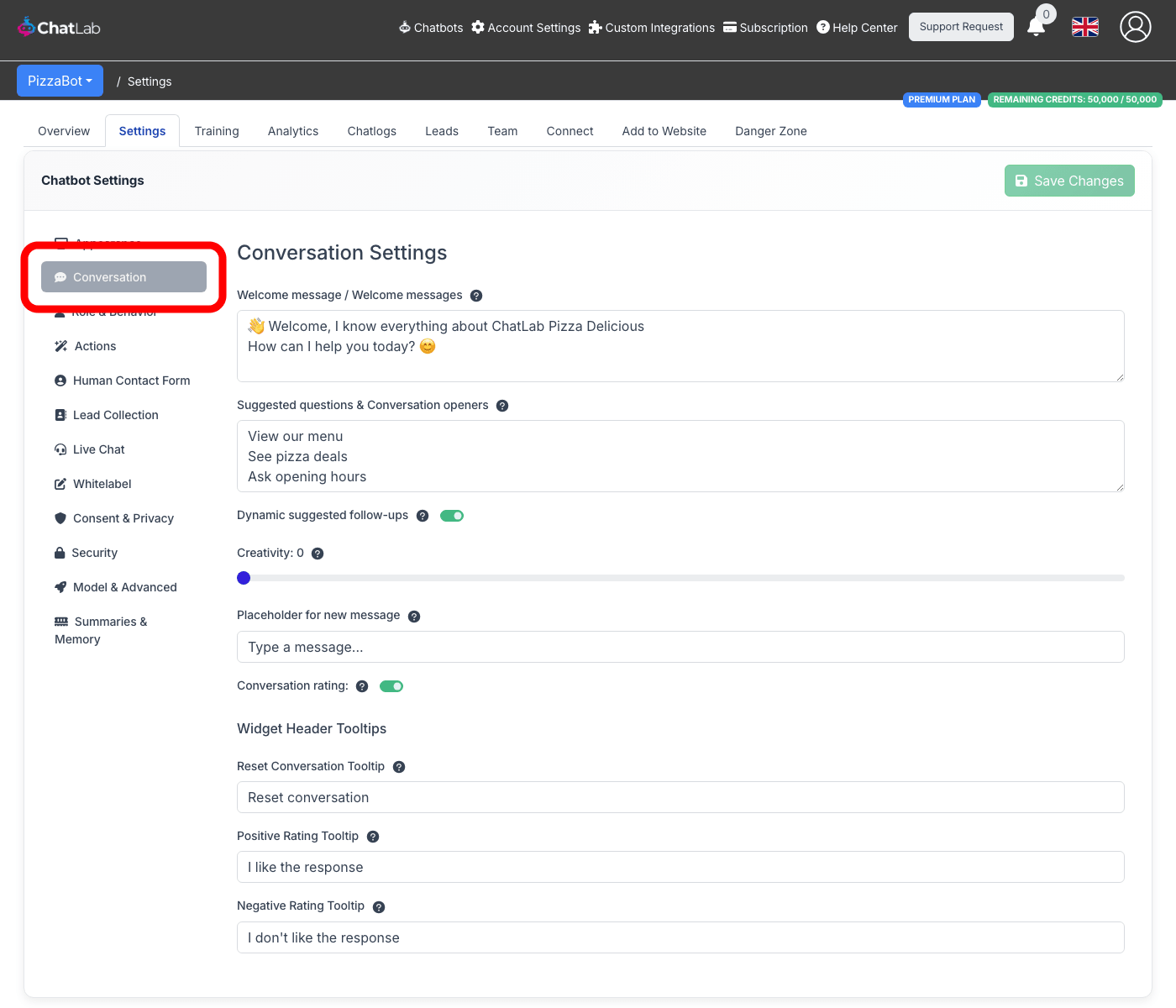
All conversation settings
Below is an overview of all available options.
Welcome message
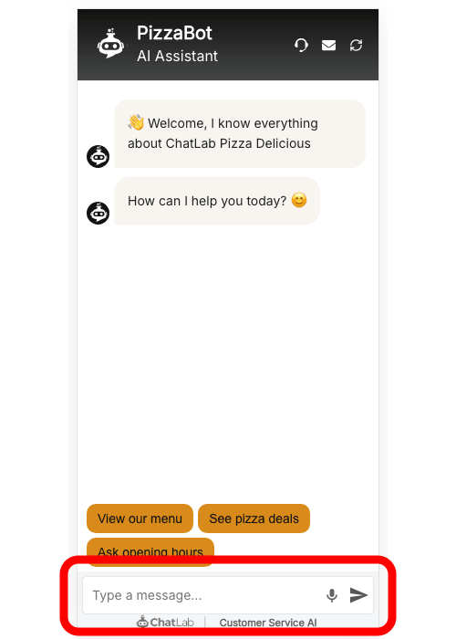
The welcome message is the first thing visitors see when the chat opens. You can add up to three separate messages, each on its own line. They are displayed in order, as individual message bubbles.
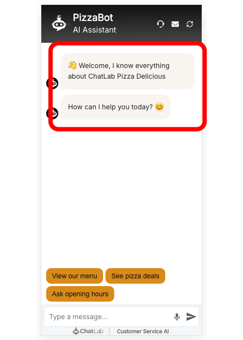
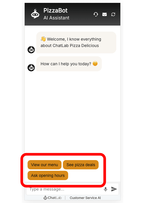
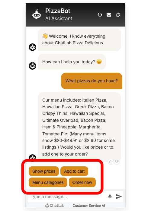
Suggested questions
Suggested questions appear as clickable buttons above the message input. They guide visitors toward common topics and help start conversations. Enter each question on a separate line (up to 6 questions).
You can use markdown syntax to display a label that differs from the actual question sent to the chatbot. Use the format:
[Button label](Actual question sent to chatbot)
For example:
[Pricing](What are your pricing plans and do you offer discounts?)
[Contact](How can I get in touch with your team?)
This displays "Pricing" and "Contact" as buttons, but when clicked, the full questions are sent to the chatbot.
Dynamic suggested follow-ups
When enabled, the chatbot automatically generates follow-up question buttons after each response, based on the conversation context. These replace the static suggested questions as the conversation progresses.
This feature works with most AI models. It is not available for Gemini models.
Creativity
The creativity slider (0 to 1) controls how creative or factual the AI responses are:
- Low values (0-0.3) - more focused, factual, and consistent responses
- Medium values (0.4-0.6) - balanced between creativity and accuracy
- High values (0.7-1.0) - longer, more creative responses, but potentially less precise
Placeholder for new message
This is the text shown inside the message input field before the visitor types anything. Use it to encourage visitors to start a conversation.
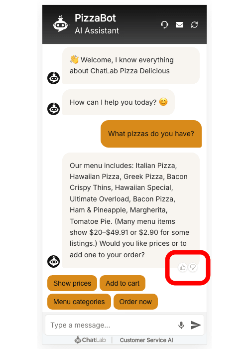
Conversation rating
When enabled, thumbs-up and thumbs-down icons appear below each bot response. Visitors can rate individual responses, and you can review the feedback in Chatlogs and Analytics.
Widget header tooltips
These settings let you customize the tooltip text that appears when visitors hover over the icons in the chat widget header.
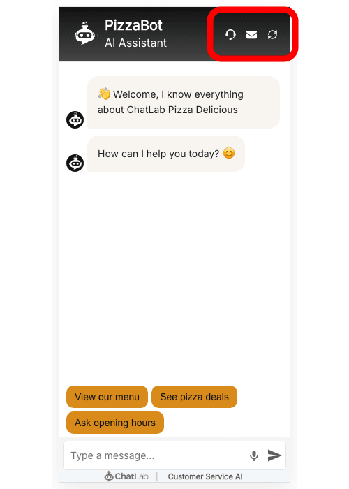
- Reset Conversation Tooltip - text shown when hovering the reset (refresh) icon
- Positive Rating Tooltip - text shown when hovering the thumbs-up icon (only visible when conversation rating is enabled)
- Negative Rating Tooltip - text shown when hovering the thumbs-down icon (only visible when conversation rating is enabled)
This is useful for translating the tooltips to match your chatbot's language or customizing the wording for your audience.