Custom forms let you build your own multi-step forms and use them in place of the built-in Lead Collection or Human Contact Form. You choose the fields, the thank-you message, and the submit button, then bind the form to the section where you want it shown.
Where to find forms
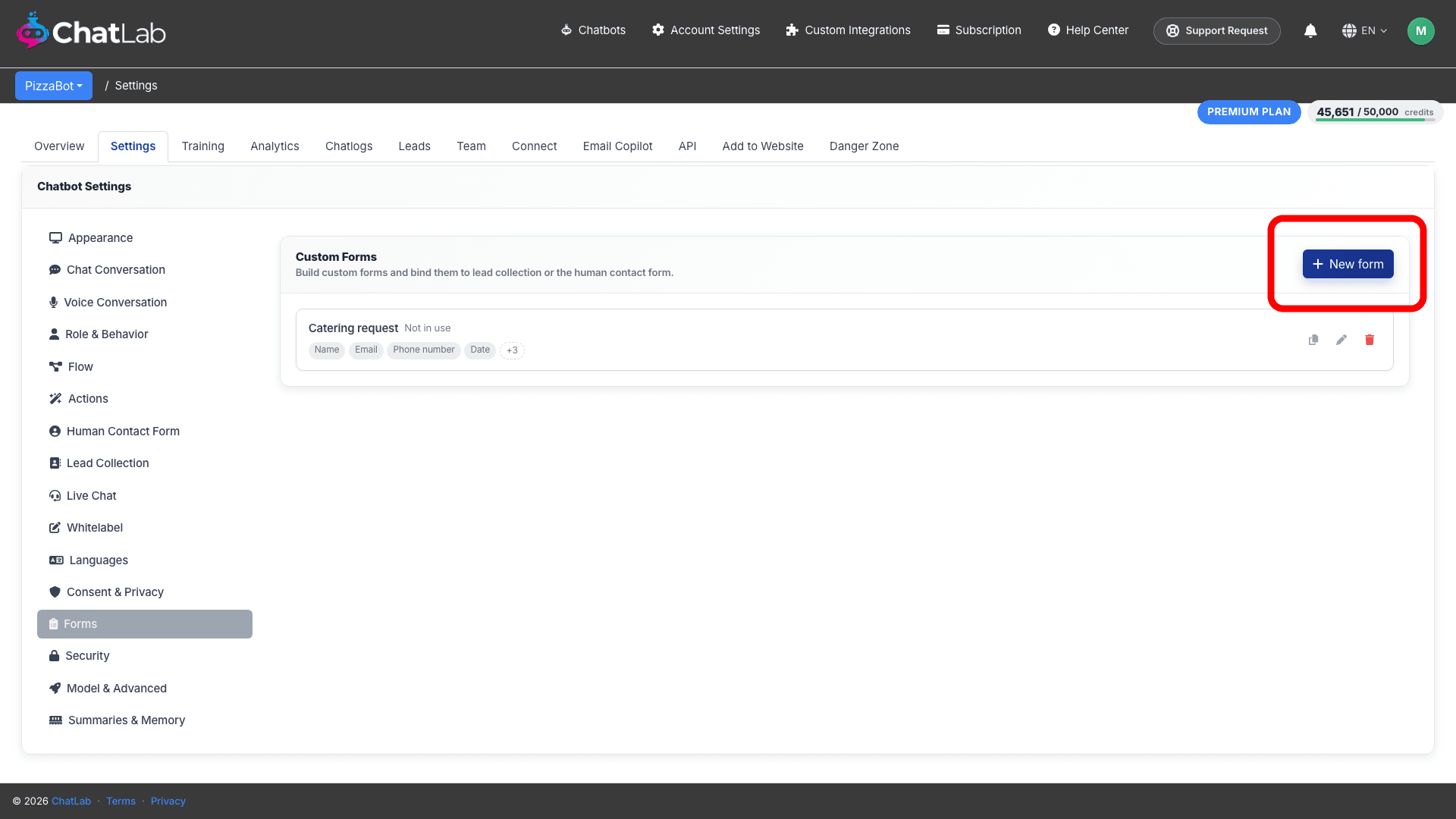
Navigate to Settings > Forms. This page lists your saved custom forms. When you have not created any yet, it shows "No custom forms yet" with a Create your first form button.
Create a form
Click New form (or Create your first form when the list is still empty) to open the form builder.
Build the form
The builder has everything you need to define the form on one screen, with a live preview on the right. In this article we build an example "Catering request" form for a pizzeria: step 1 collects contact details, step 2 asks about the event.
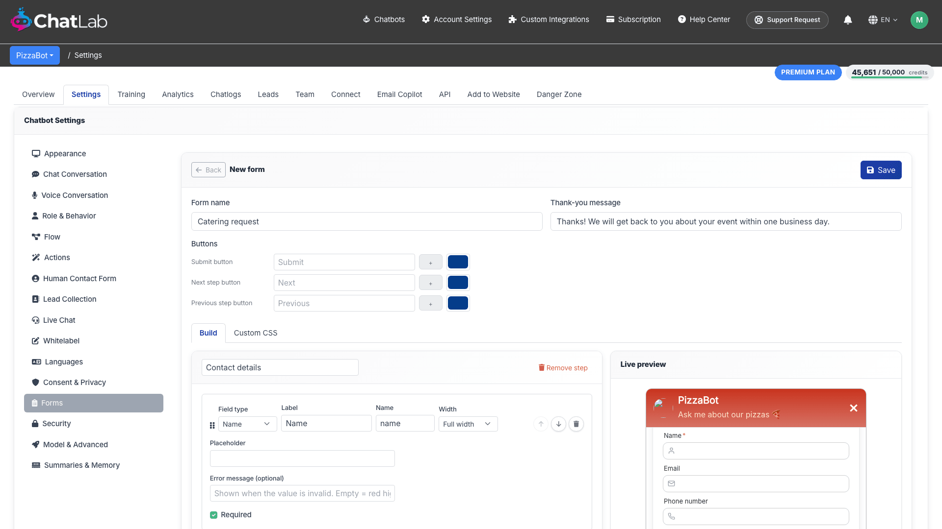
- Form name - an internal name so you can identify the form in the dropdowns later.
- Thank-you message - the confirmation text shown after a visitor submits the form.
- Submit button - set the button label, pick an optional icon, and choose its color.
- Build and Custom CSS tabs - build the fields visually, or switch to Custom CSS to apply your own styles.
Add fields
On the Build tab, give the step an optional title, then click a field-type button to add that field. You can add as many fields as you need, mixing any of the types below in a single form.
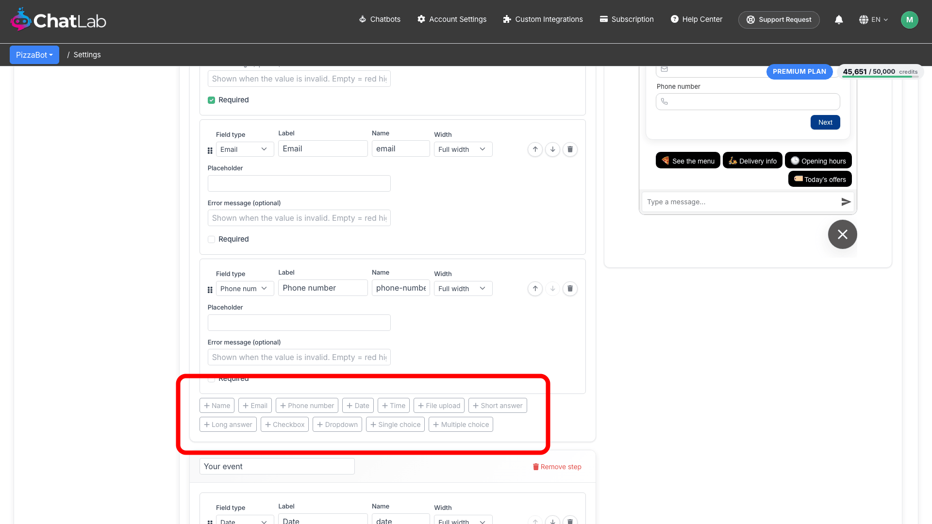
- Name - a single-line field for the visitor's name.
- Email - captures an email address, validated as an email.
- Phone number - captures a phone number.
- Date - a date picker.
- Time - a time picker.
- File upload - lets the visitor attach and upload a file (see below).
- Short answer - a single-line free-text field.
- Long answer - a larger multi-line field for longer responses.
- Checkbox - a single tick box, for example to accept terms.
- Dropdown - a menu where the visitor picks one option from a list.
- Single choice - a set of options where the visitor picks exactly one.
- Multiple choice - a set of options where the visitor can tick several at once.
Each field has a Label (what the visitor sees) and a Name (the internal key used in exports and notifications). You can mark a field Required, set its Width so fields sit side by side, and drag fields to reorder them. Dropdown, Single choice, and Multiple choice fields also take a list of options, one per line.
Add steps
For longer forms, split the fields across steps instead of one long screen. Click Add step to add another step, then drag or add fields into it. Each step is its own card with an optional title.
Visitors see each step as a separate screen in the chat and move between them with Next and Previous buttons, which appear automatically once a form has more than one step. When a form is multi-step, the builder also lets you set the label, icon, and color for the Next and Previous buttons.
Give each step a short, action-oriented title (for example "Your details", then "Your request") so visitors always know where they are in the form.
File upload fields
A File upload field lets a visitor attach a file to their submission. For each file field you can set:
- Accepted extensions - a comma-separated list, for example
pdf, png, jpg. Only files with these extensions are allowed. - Max size - the maximum file size in MB, up to 10 MB.
Uploads are checked on submission: the extension must be in your allowed list, the file must be within the size limit, and its actual contents must match the declared type.
Live preview
The Live preview panel on the right shows the form exactly as visitors will see it, updating as you add fields, add steps, and change the styling.
When the form is ready, click Save. The form now appears in your list under Settings > Forms.
Use a custom form
A saved custom form does not appear to visitors on its own. Bind it to a section:
- Settings > Lead Collection - open the Form shown to the visitor dropdown and select your custom form instead of the built-in form.
- Settings > Human Contact Form - open the Form shown to the visitor dropdown and select your custom form instead of the built-in form.
The visitor then sees your custom form wherever that section is triggered.
How it looks to the visitor
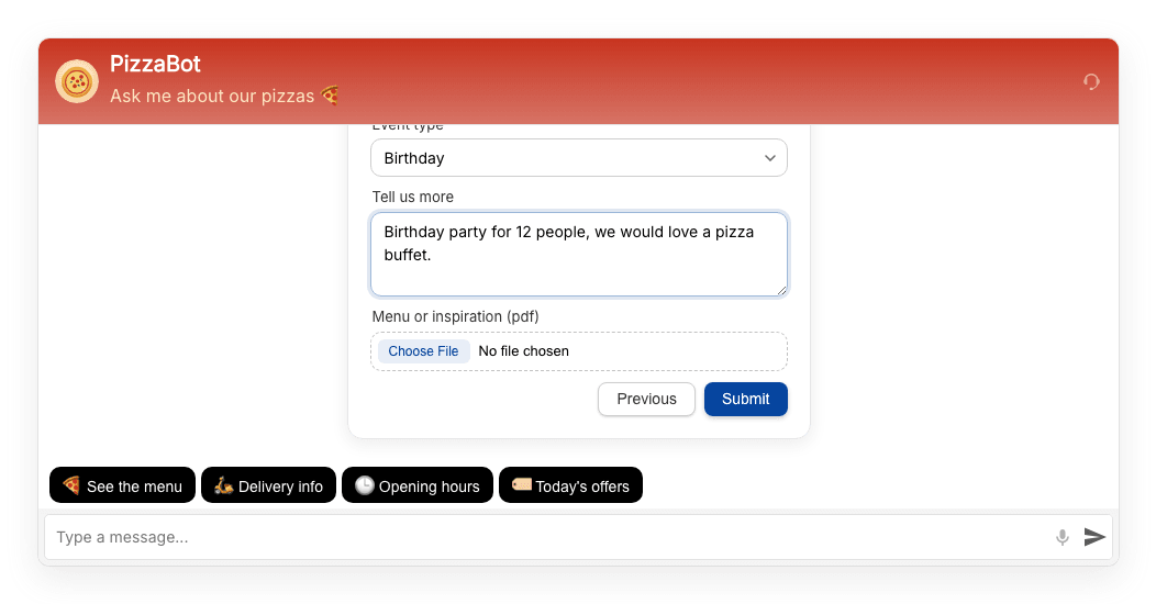
The form appears inside the chat window. Here is the example "Catering request" form bound to Lead Collection: the visitor sees step 1 with the contact fields and moves on with the Next button.
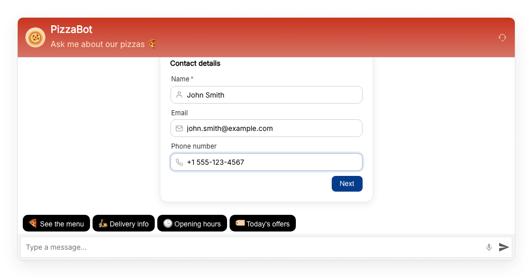
Step 2 shows the event fields, including the Dropdown, the Long answer, and the File upload field. The visitor can go back with Previous or send the form with Submit. After submitting, the thank-you message you set in the builder is shown in the chat.
See submissions in the Leads tab
When a visitor submits a custom form that is bound to Lead Collection or the Human Contact Form, the submission is saved as a lead. Open the bot's Leads tab to review it.
Alongside the standard Name, Email, Phone, Collected date, and Entry point, a Form data column shows the full submission: each field's label followed by the value the visitor entered, one line per field. For a File upload field, the uploaded file's name is shown; the lead notification email and the CSV export (the Export button on the Leads tab) both include a download link to the file itself.
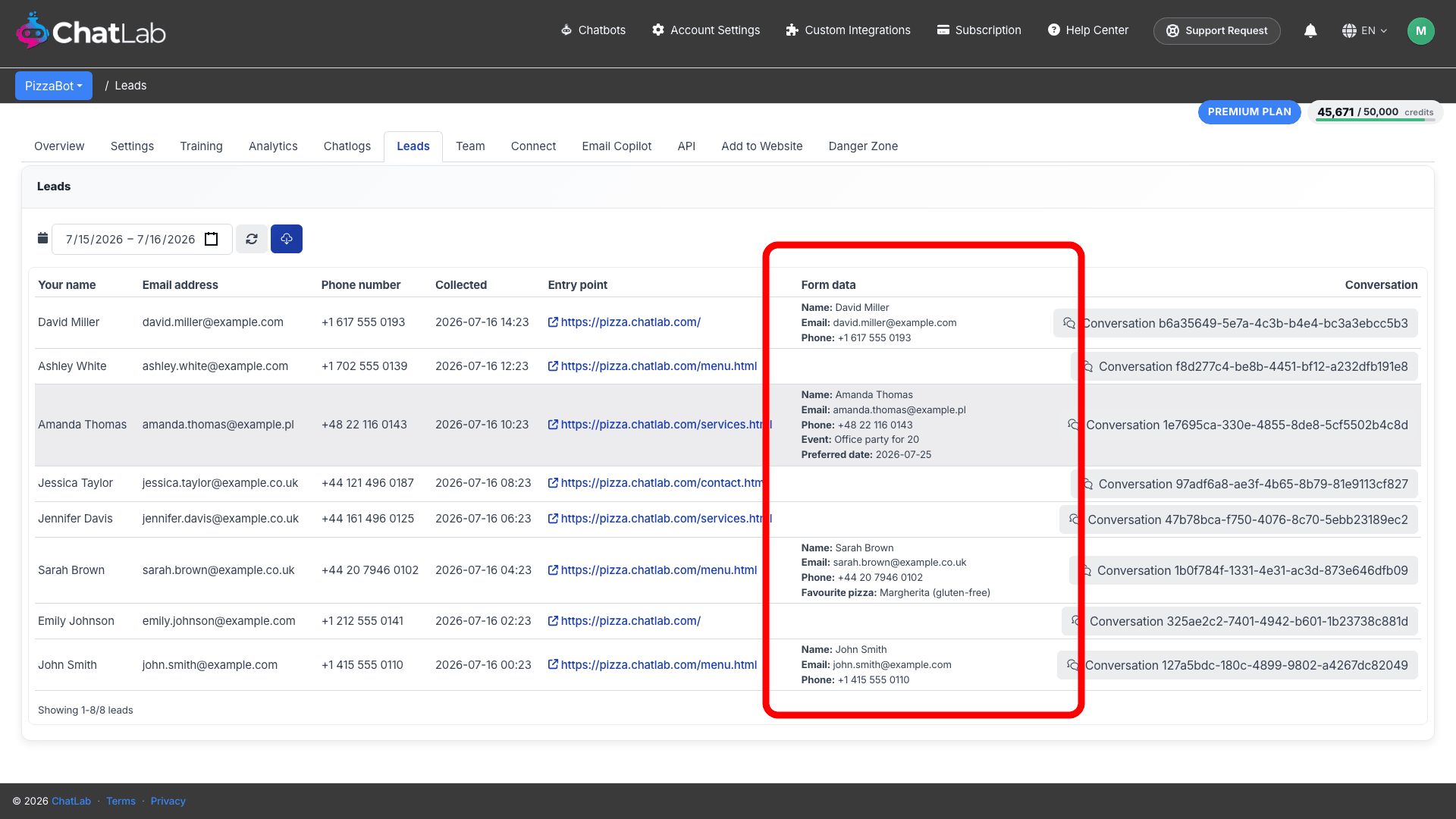
From each lead you can also click through to the full Conversation to see the chat around the submission.