Ustawienia wyglądu (Appearance) kontrolują to, jak widget czatu Twojego chatbota prezentuje się osobom odwiedzającym Twoją stronę internetową - nagłówek, kolory i fonty wiadomości, ikonę uruchamiania, ekran powitalny, rozmiar widgetu i wiele więcej. W tym miejscu dopasujesz widget do swojej marki.
Zanim przejdziesz do stylizacji, musisz utworzyć chatbota. Jeśli jeszcze go nie masz, zacznij od artykułu Jak utworzyć swojego pierwszego chatbota.
Gdzie znaleźć ustawienia wyglądu
Wybierz swojego chatbota i przejdź do Settings > Appearance (Ustawienia > Wygląd). Na stronie głównej ChatLab kliknij Chatbots (Chatboty), otwórz swojego chatbota, przejdź do zakładki Settings (Ustawienia), a następnie wybierz Appearance (Wygląd) w lewym menu.
Podgląd widgetu na żywo wyświetla się po prawej stronie ekranu i aktualizuje się na bieżąco podczas wprowadzania zmian.
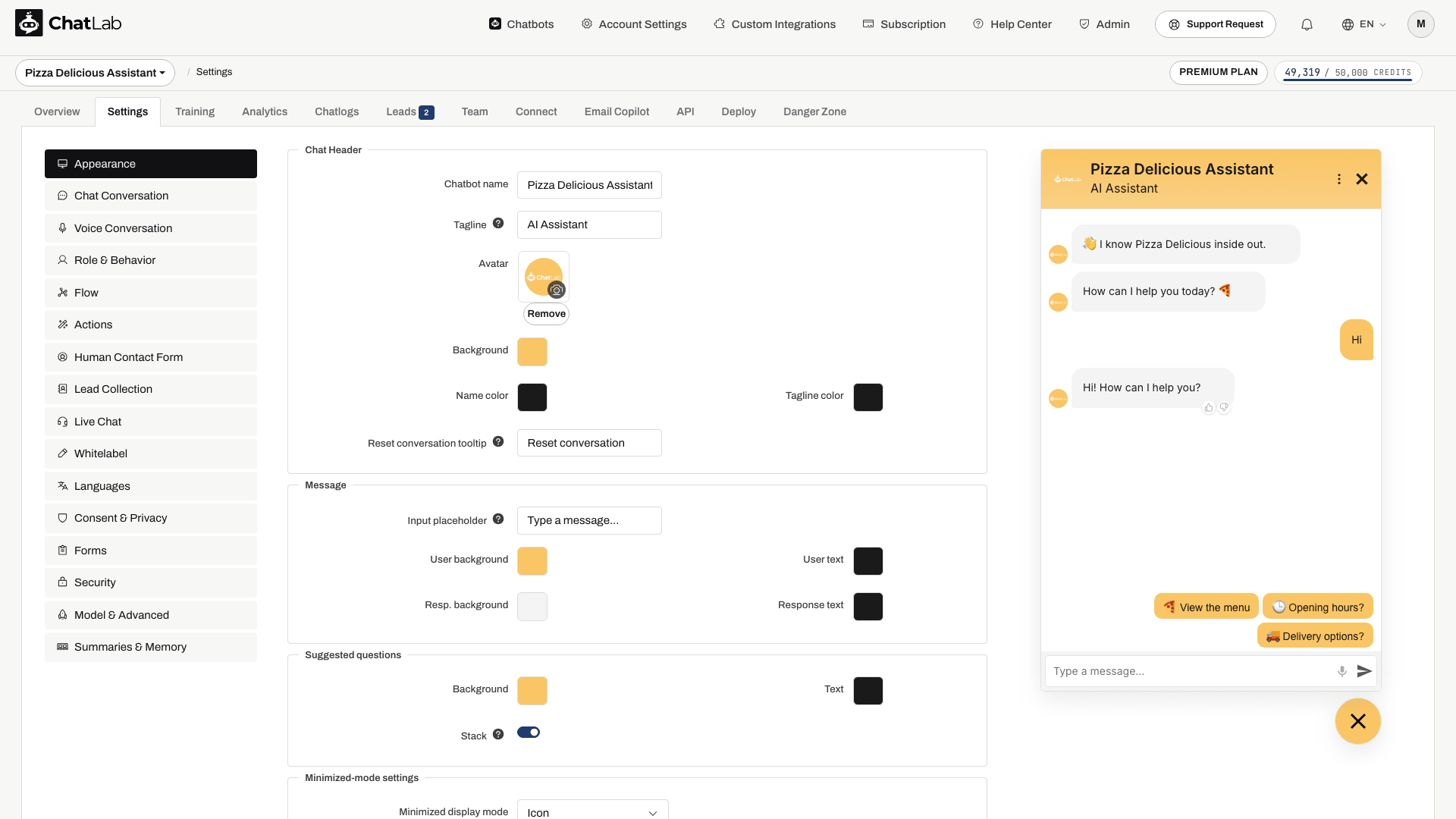
Nagłówek czatu (Chat Header)
Skonfiguruj wygląd górnej sekcji widgetu czatu:
- Chatbot name (Nazwa chatbota) - nazwa wyświetlana w nagłówku czatu (maksymalnie 60 znaków)
- Tagline (Podtytuł) - opcjonalny podtytuł wyświetlany pod nazwą chatbota (maksymalnie 60 znaków)
- Avatar (Awatar) - prześlij własną grafikę, którą klienci zobaczą podczas rozmowy z chatbotem. Użyj przycisku Remove (Usuń), zaznaczonego poniżej, aby usunąć bieżący obraz.
- Background (Tło) - kolor tła obszaru nagłówka
- Name color (Kolor nazwy) - kolor tekstu nazwy chatbota
- Tagline color (Kolor podtytułu) - kolor tekstu podtytułu
- Reset conversation tooltip (Podpowiedź resetowania rozmowy) - tekst podpowiedzi wyświetlanej po najechaniu kursorem na przycisk resetowania rozmowy w nagłówku widgetu (maksymalnie 40 znaków, domyślnie "Reset conversation")
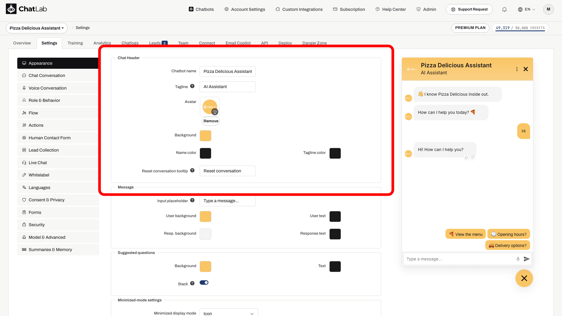
Wiadomość (Message)
Dostosuj pole wprowadzania wiadomości oraz wygląd wiadomości w rozmowie:
- Input placeholder (Placeholder pola wprowadzania) - tekst zastępczy wyświetlany w polu nowej wiadomości na dole widgetu (maksymalnie 50 znaków, domyślnie "Type a message..."). Użyj go, aby zachęcić użytkowników do rozpoczęcia pisania.
- User background (Tło użytkownika) - kolor tła wiadomości wysyłanych przez użytkownika
- User text (Tekst użytkownika) - kolor tekstu wiadomości użytkownika
- Resp. background (Tło odpowiedzi) - kolor tła odpowiedzi chatbota
- Response text (Tekst odpowiedzi) - kolor tekstu odpowiedzi chatbota
Rozmiar tekstu wiadomości ustawia się w sekcji Typografia, razem z fontem widgetu.

Sugerowane pytania (Suggested Questions)
Sugerowane pytania to gotowe podpowiedzi, które użytkownik może kliknąć, aby rozpocząć rozmowę. Same pytania tworzy się w Settings > Chat Conversation (Ustawienia > Rozmowa czatu); tutaj konfiguruje się wygląd przycisków:
- Background (Tło) - kolor tła przycisków sugerowanych pytań
- Text (Tekst) - kolor tekstu przycisków sugerowanych pytań
- Stack (Układ pionowy) - po włączeniu dłuższe sugerowane pytania układają się pionowo jedno pod drugim, zamiast wyświetlać poziomy pasek przewijania
Rozmiar tekstu sugerowanych pytań ustawia się w sekcji Typografia.

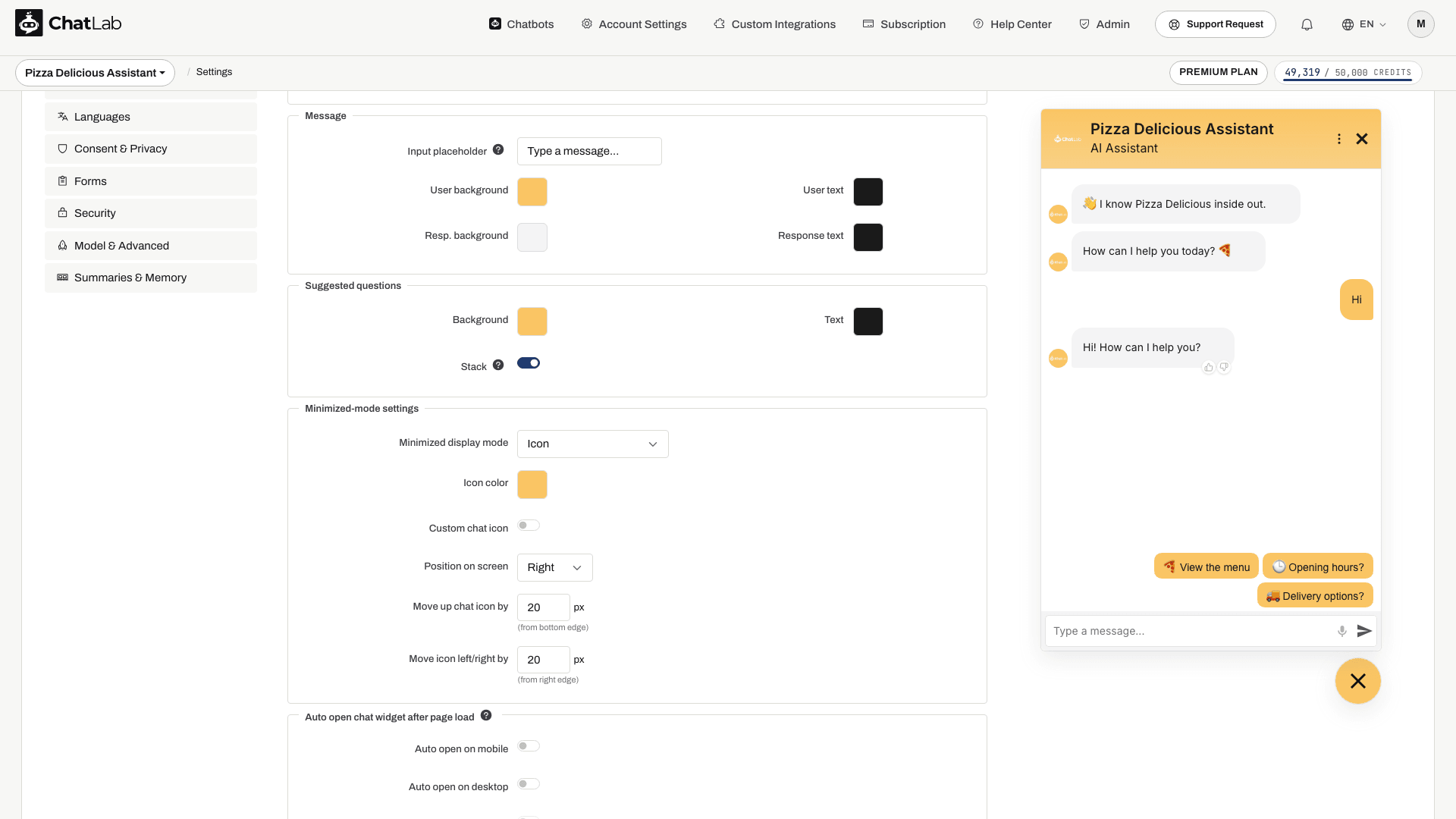
Ustawienia trybu zminimalizowanego (Minimized-Mode Settings)
Określ, jak widget czatu wygląda po zminimalizowaniu (zanim odwiedzający otworzy czat):
- Tryb wyświetlania po zminimalizowaniu (Minimized display mode) - wybierz jedną z opcji:
- Ikona (Icon) - standardowa okrągła ikona uruchamiania czatu (domyślna)
- Zminiaturyzowany pasek czatu (Minified chat bar) - kompaktowy pasek wprowadzania tekstu wyświetlany na dole strony
- Ikona z tekstem (Icon with text) - szerszy przycisk w kształcie pigułki: ikona wraz z krótkim, dwuwierszowym podpisem
- Kolor ikony / Kolor minipaska (Icon color / Mini bar color) - kolor ikony uruchamiania lub tła minipaska
- Własna ikona czatu (Custom chat icon) (tylko w trybie ikony) - włącz, aby wgrać własne ikony otwarcia/zamknięcia czatu
- Pozycja na ekranie (Position on screen) - umieść widget po lewej lub prawej stronie ekranu
- Przesuń ikonę/pasek czatu w górę o (Move up chat icon/bar by) - pionowe przesunięcie w pikselach od dolnej krawędzi
- Przesuń ikonę/pasek w lewo/w prawo o (Move icon/bar left/right by) - poziome przesunięcie w pikselach od najbliższej krawędzi ekranu
Ikona z tekstem (Icon with Text)
Tryb Ikona z tekstem (Icon with text) dodaje do przycisku uruchamiania krótki podpis, dzięki czemu odwiedzający widzą cel czatu, zanim go otworzą. Przydaje się to, gdy sama ikona nie jest wystarczająco czytelna - na przykład „Napisz do nas / Odpowiadamy od razu” lub „Potrzebujesz pomocy? / Zapytaj naszego asystenta”.
Wybór tego trybu dodaje cztery ustawienia:
- Tekst w wierszu 1 (Label line 1) - pierwszy, mocniej wyróżniony wiersz podpisu (maks. 60 znaków)
- Tekst w wierszu 2 (Label line 2) - drugi, delikatniejszy wiersz (maks. 60 znaków). Pozostaw puste, aby uzyskać przycisk jednowierszowy
- Kolor tekstu (Text color) - kolor podpisu. Jeśli pozostawisz to pole bez zmian, ChatLab dobierze kolor czarny lub biały automatycznie, zależnie od tego, jak jasny lub ciemny jest kolor Twojego przycisku uruchamiania
- Pokaż krzyżyk zamknięcia (Show close cross) - dodaje mały krzyżyk do przycisku uruchamiania, aby odwiedzający mogli go ukryć
Oba wiersze są skracane wielokropkiem, jeśli się nie mieszczą, więc przycisk uruchamiania nigdy nie rozszerza się bardziej niż szerokość ekranu. Gdy czat jest otwarty, przycisk uruchamiania zwija się z powrotem do okręgu.
Jeśli obsługa wielu języków jest włączona, oba wiersze podpisu są tłumaczone tak samo, jak pozostałe teksty widoczne dla odwiedzających.
Opcja Pokaż krzyżyk zamknięcia (Show close cross) jest domyślnie wyłączona i dostępna tylko w tym trybie. Po jej włączeniu odwiedzający, który kliknie krzyżyk, ukrywa przycisk uruchamiania na resztę swojej sesji przeglądania - pozostaje on ukryty podczas przechodzenia między podstronami i powraca przy następnej wizycie lub w nowej karcie. Chatbot ustawiony na automatyczne otwieranie respektuje ten wybór i nie otworzy się ponownie po odrzuceniu go przez odwiedzającego.

Automatyczne otwieranie widgetu po załadowaniu strony (Auto Open Chat Widget After Page Load)
Skonfiguruj automatyczne rozwijanie czatu po wejściu użytkownika na stronę:
- Auto open on mobile (Automatycznie otwieraj na urządzeniach mobilnych) - automatycznie otwiera czat na urządzeniach mobilnych
- Auto open on desktop (Automatycznie otwieraj na komputerach) - automatycznie otwiera czat na ekranach komputerów
- Open chat with delay (Otwórz czat z opóźnieniem) - włącza opóźnienie przed automatycznym otwarciem (dostępne tylko wtedy, gdy automatyczne otwieranie jest włączone)
- Delay by (Opóźnienie o) - liczba sekund oczekiwania przed otwarciem (0-60 sekund)
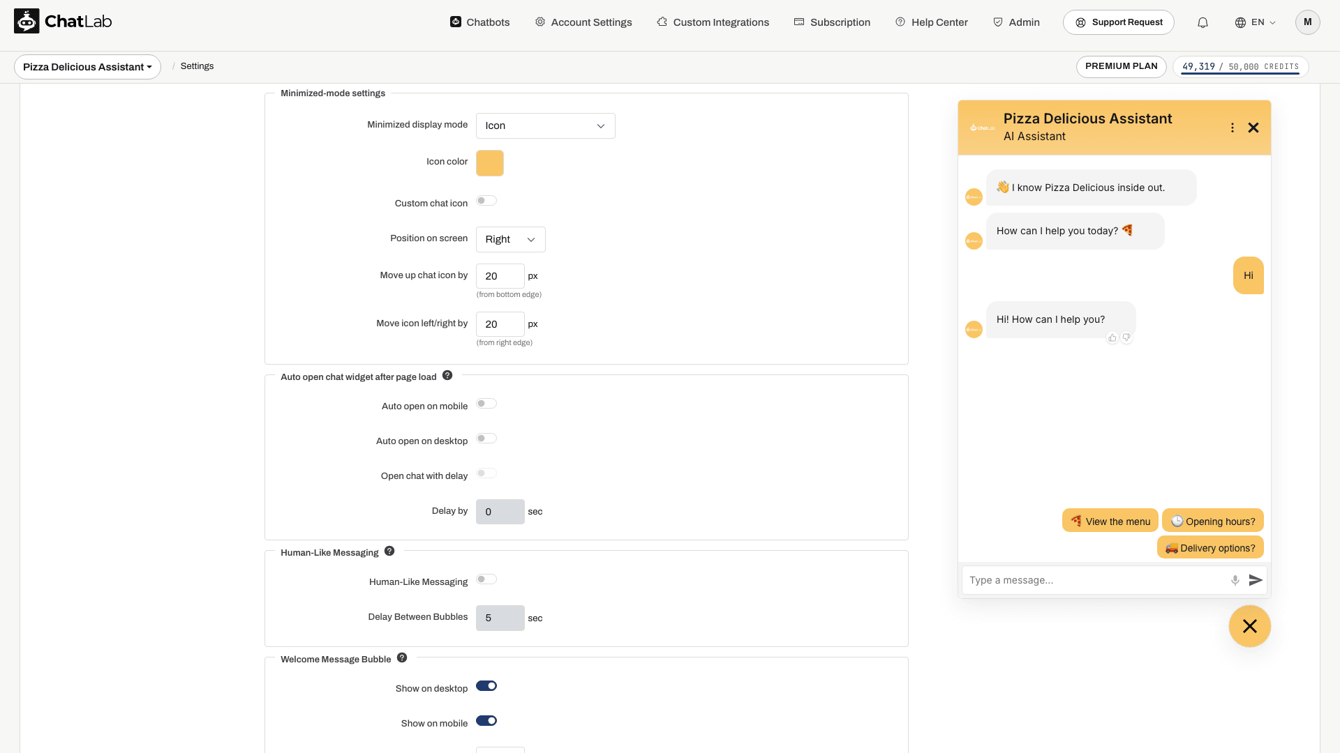
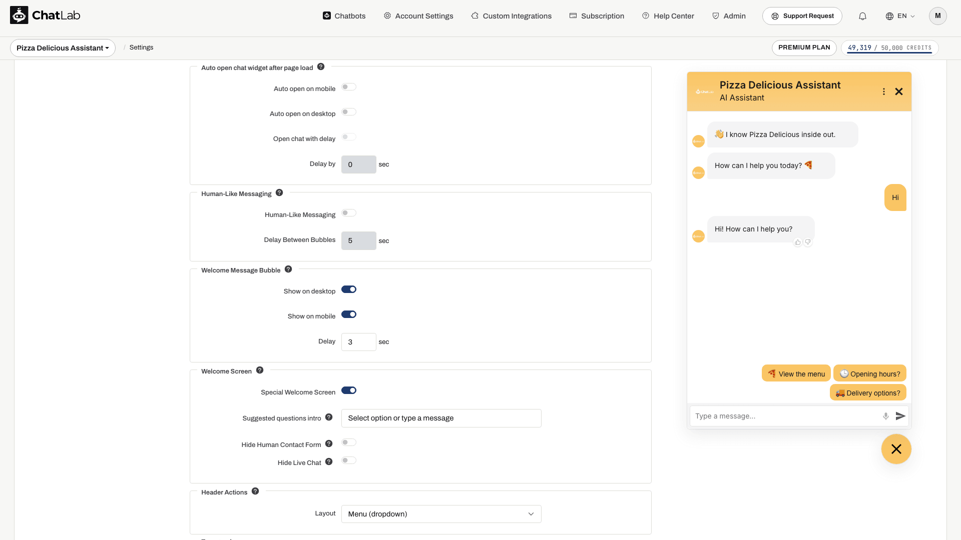
Wiadomości imitujące pisanie przez człowieka (Human-Like Messaging)
Symuluje naturalne pisanie przez człowieka poprzez dzielenie odpowiedzi na kilka dymków wiadomości, wyświetlanych stopniowo zdanie po zdaniu:
- Human-Like Messaging - przełącznik do włączania/wyłączania funkcji
- Delay Between Bubbles (Opóźnienie między dymkami) - czas w sekundach pomiędzy wyświetleniem kolejnych dymków wiadomości (0-200 sekund)
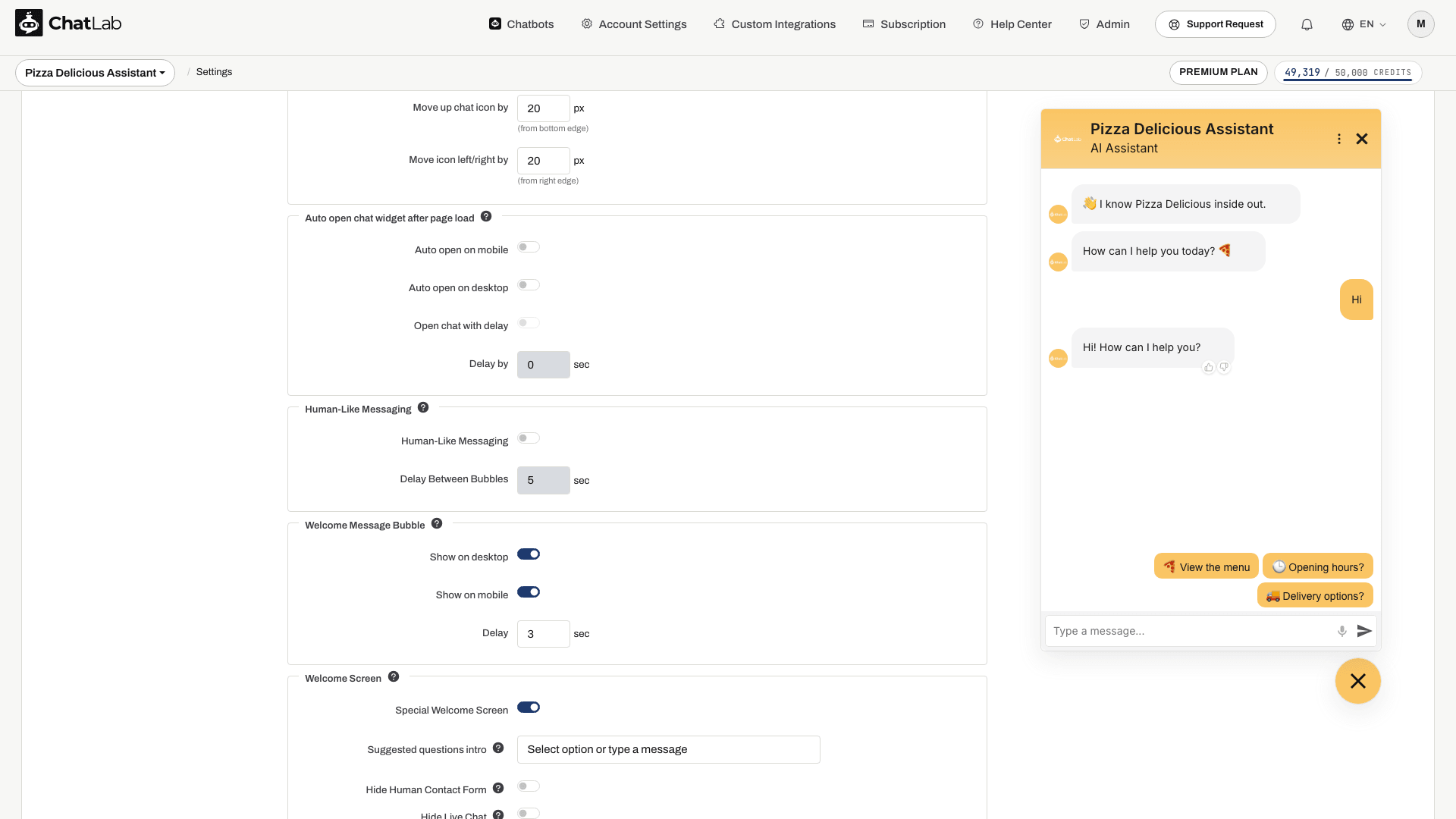
Dymek wiadomości powitalnej (Welcome Message Bubble)
Wyświetl wiadomość powitalną w dymku nad ikoną uruchamiania czatu, aby ułatwić użytkownikom zauważenie czatu. Ta funkcja jest dostępna tylko w trybie ikony i nie działa w trybie iframe ani przy włączonym automatycznym otwieraniu czatu.
- Show on desktop (Pokaż na komputerach) - wyświetla dymek wiadomości powitalnej na komputerach
- Show on mobile (Pokaż na urządzeniach mobilnych) - wyświetla dymek wiadomości powitalnej na urządzeniach mobilnych
- Delay (Opóźnienie) - liczba sekund po załadowaniu strony, po której dymek się pojawi (0-60 sekund)
W przypadku zdefiniowania kilku wiadomości powitalnych wyświetlą się one ułożone jedna nad drugą nad ikoną czatu.
Wprowadzanie głosowe (przycisk mikrofonu w polu wprowadzania wiadomości) konfiguruje się w zakładce Settings > Chat Conversation (Ustawienia > Rozmowa czatu), a nie w sekcji Wygląd.
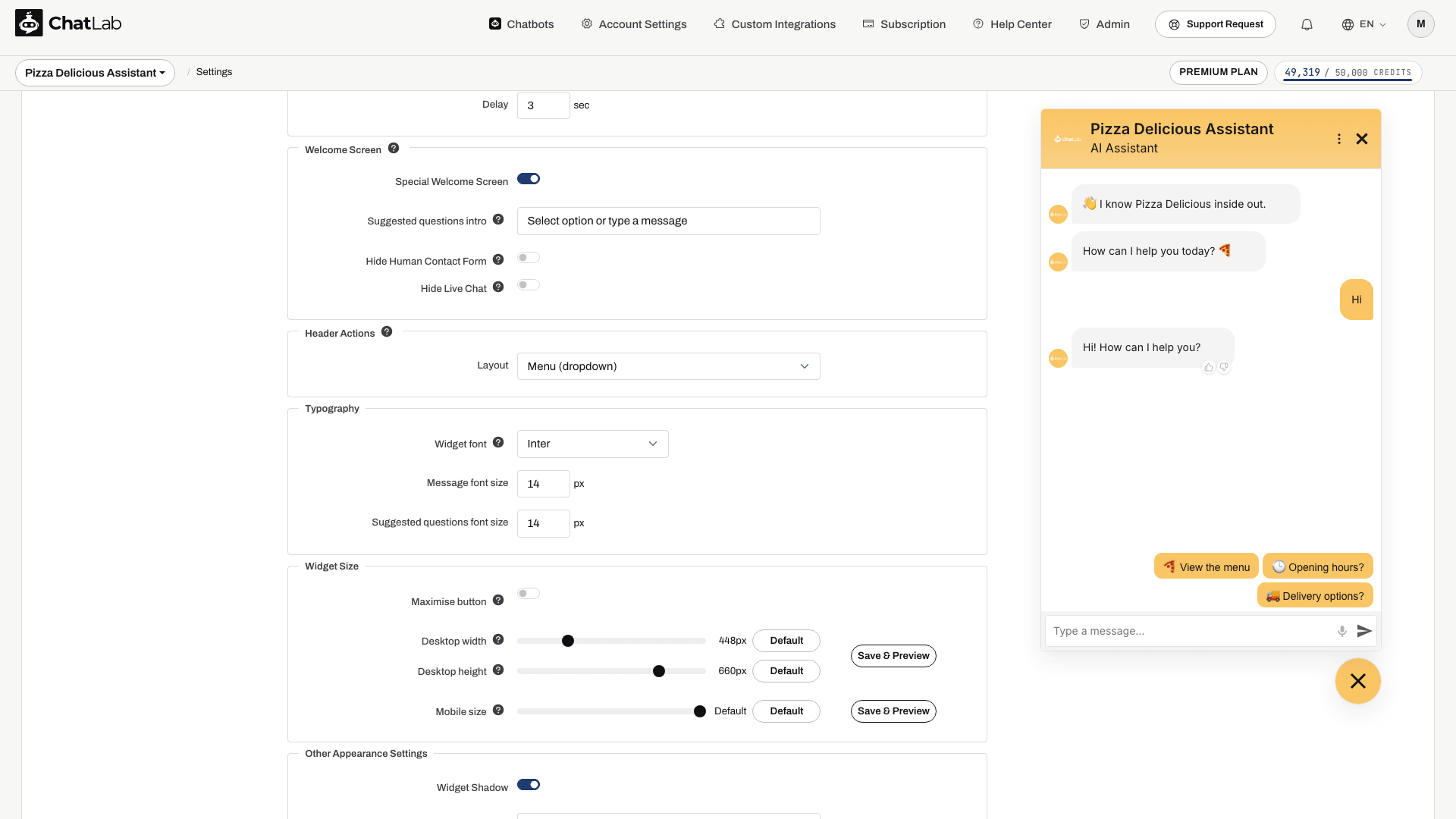
Ekran powitalny (Welcome Screen)
Przełącz widget w specjalny układ początkowy, który wita nowych użytkowników dużą wiadomością powitalną oraz sugerowanymi pytaniami ułożonymi na wyśrodkowanej, białej karcie. Ekran powitalny pojawia się tylko na początku nowej sesji i przełącza się na standardowy widok czatu w momencie, gdy użytkownik wyśle swoją pierwszą wiadomość.
- Special Welcome Screen (Specjalny ekran powitalny) - włącza lub wyłącza tryb ekranu powitalnego (domyślnie wyłączony)
- Suggested questions intro (Wstęp do sugerowanych pytań) - krótki tekst wyświetlany nad kartą sugerowanych pytań na ekranie powitalnym (na przykład "Wybierz opcję lub wpisz wiadomość"). Pozostaw puste, aby ukryć etykietę. Wymaga wcześniejszego skonfigurowania sugerowanych pytań w Settings > Chat Conversation.
- Hide Human Contact Form (Ukryj formularz kontaktu z człowiekiem) - ukrywa akcję formularza kontaktowego w nagłówku na czas wyświetlania ekranu powitalnego
- Hide Live Chat (Ukryj Live Chat) - ukrywa akcję czatu na żywo w nagłówku na czas wyświetlania ekranu powitalnego
Ekran powitalny integruje się również ze zbieraniem leadów (Lead Collection) oraz zgodą na politykę prywatności (Privacy Policy consent) - jeśli którekolwiek z nich jest wymagane na początku rozmowy, formularz lub prośba o zgodę wyświetla się na karcie powitalnej zamiast sugerowanych pytań.
Pełne informacje, warianty układu oraz zrzuty ekranu od strony użytkownika znajdziesz w artykule Ekran powitalny.
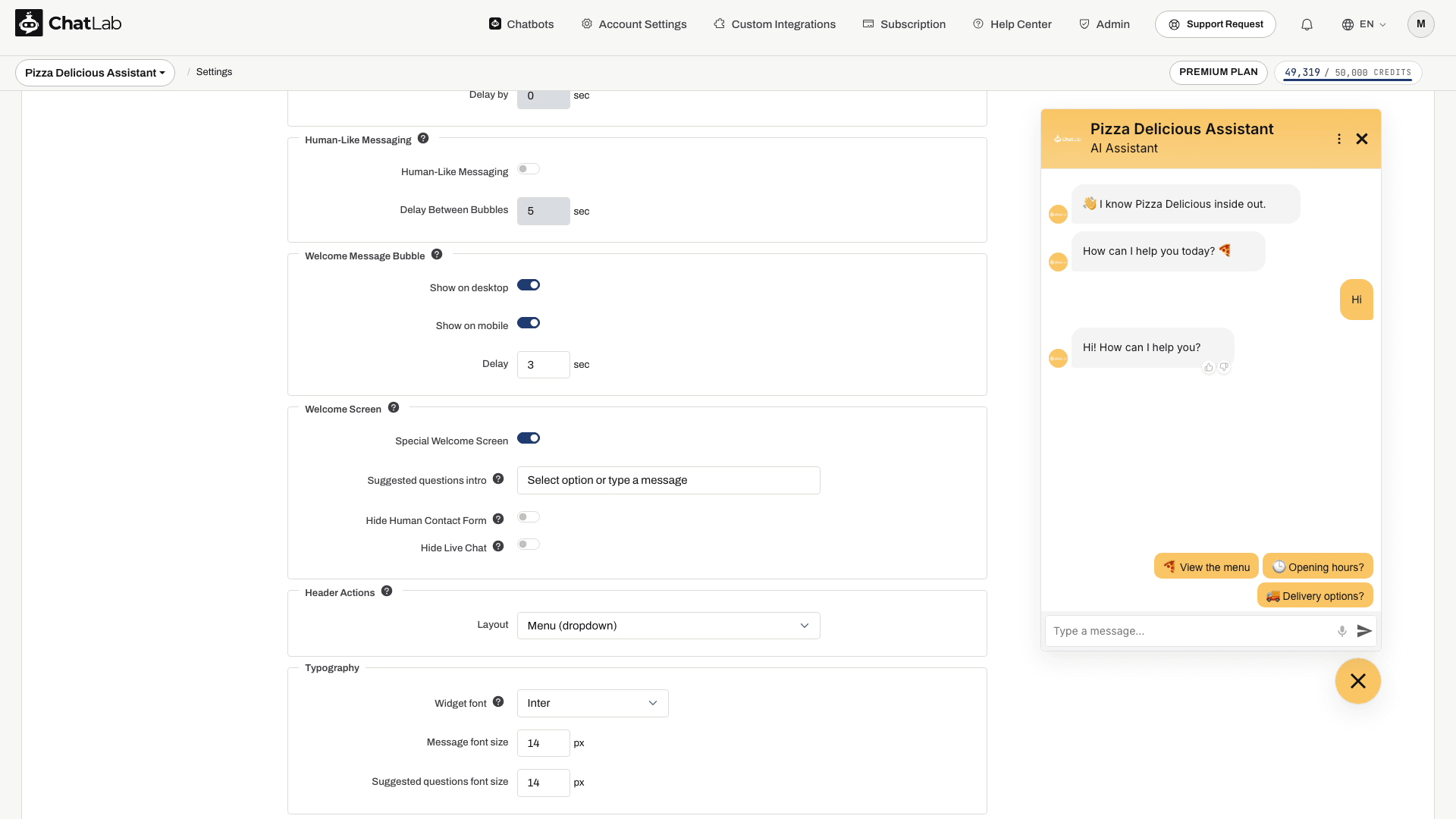
Akcje w nagłówku (Header Actions)
Steruje sposobem wyświetlania funkcji Live Chat oraz formularza kontaktu z człowiekiem (Human Contact Form) w nagłówku widgetu czatu.
- Separate icons (Osobne ikony) - każda akcja otrzymuje osobną ikonę w nagłówku, obok przycisku zamykania
- Menu (dropdown) (Menu rozwijane) - obie akcje zostają przeniesione do menu w nagłówku (ikona trzech kropek), obok takich pozycji jak "Reset conversation" czy przełącznik języków, o ile są one włączone
Nowe chatboty domyślnie korzystają z menu, co zapobiega przeładowaniu nagłówka w miarę dodawania kolejnych akcji. Chatboty utworzone przed 2 września 2026 r. zachowują osobne ikony, więc dla ich użytkowników nic się nie zmienia. Wybór można zmienić w dowolnym momencie - ustawienie wpływa wyłącznie na prezentację, a nie na działanie samych akcji.
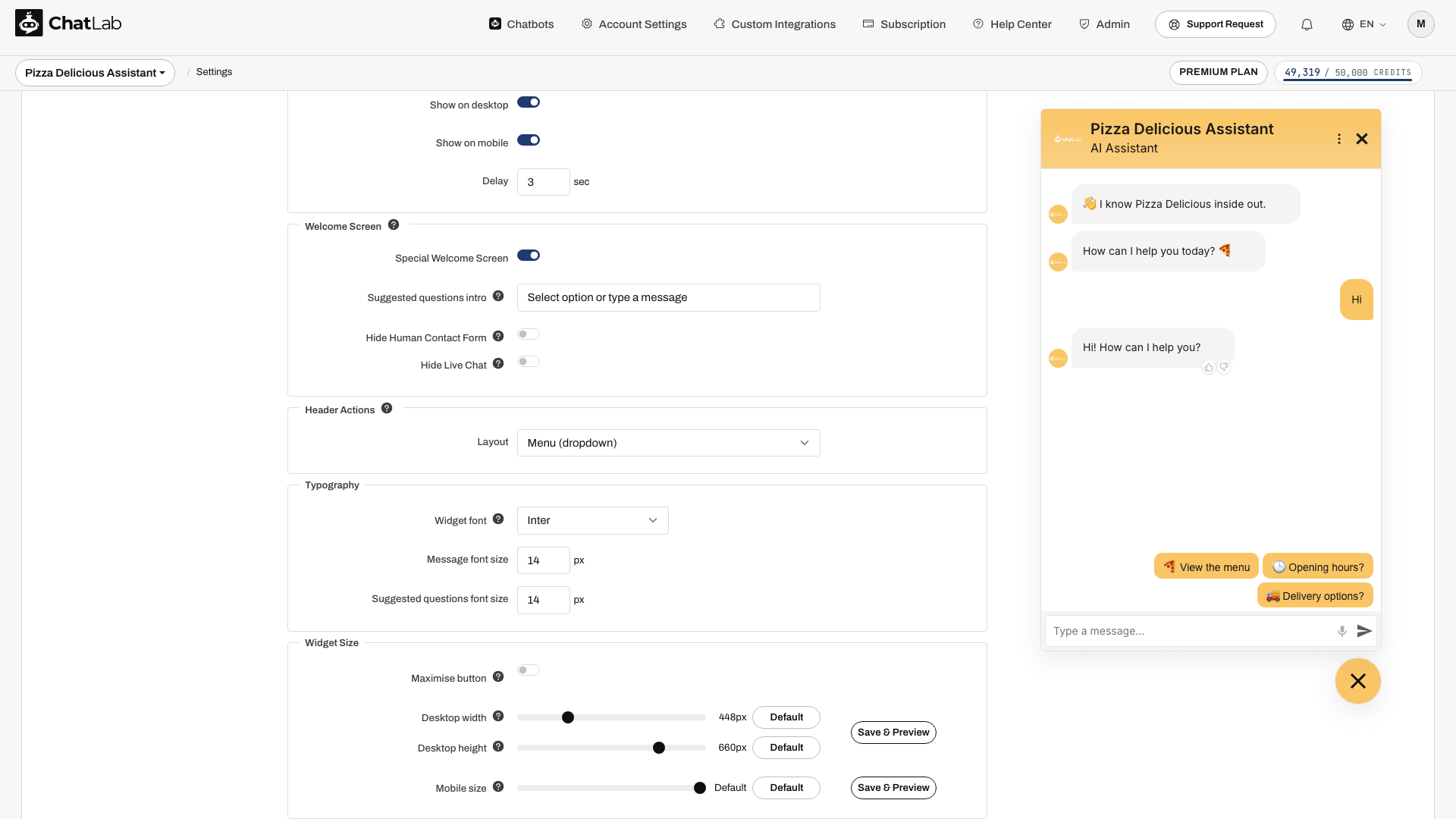
Typografia
Ustawia krój i rozmiary tekstu używane w całym widżecie - w wiadomościach, sugerowanych pytaniach, nagłówku, formularzach i podpisie przycisku uruchamiającego (launchera).
- Widget font (Czcionka widgetu) - jeden z ośmiu krojów pisma: System default (Domyślna systemowa), Inter, Nunito, Lato, Montserrat, Poppins, Source Serif i JetBrains Mono
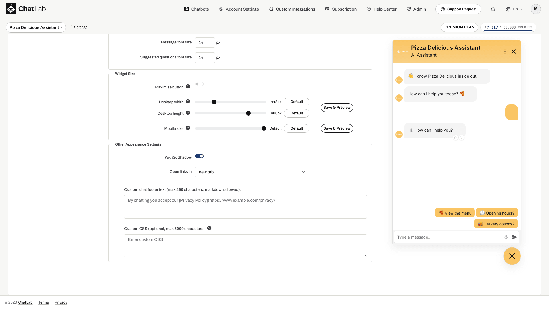
- Message font size (Rozmiar czcionki wiadomości) - wielkość tekstu wiadomości (12-24 px)
- Suggested questions font size (Rozmiar czcionki sugerowanych pytań) - wielkość przycisków sugerowanych pytań (12-24 px)
Inter jest opcją domyślną i odpowiada temu, jak każdy chatbot wyglądał przed wprowadzeniem tego ustawienia, więc nic się nie zmieni, dopóki nie wybierzesz innego kroju.
System default nie pobiera zupełnie nic - widget korzysta z czcionki zainstalowanej już na urządzeniu użytkownika. To najszybsza opcja, która doskonale wtapia się w strony używające krojów systemowych, ale czat będzie wyglądał nieco inaczej na systemach Windows, macOS i Android. Pozostałych siedem opcji to czcionki Google Fonts pobierane jednorazowo przez przeglądarkę odwiedzającego. Każda z nich ma czcionkę zapasową (fallback), więc jeśli sieć użytkownika blokuje Google Fonts, tekst pozostanie czytelny, a układ się nie rozpadnie.
Plik czcionki jest pobierany bezpośrednio do okna czatu. Zostaje dodany do Twojej strony tylko wtedy, gdy widget wyświetla tekst poza oknem czatu - przy launcherze Icon with text (Ikona z tekstem), zminimalizowanym pasku czatu lub dymkach wiadomości powitalnej. Chatbot używający samej ikony launchera nie generuje żadnego dodatkowego zapytania na Twojej stronie.
Rozmiar widgetu (Widget Size)
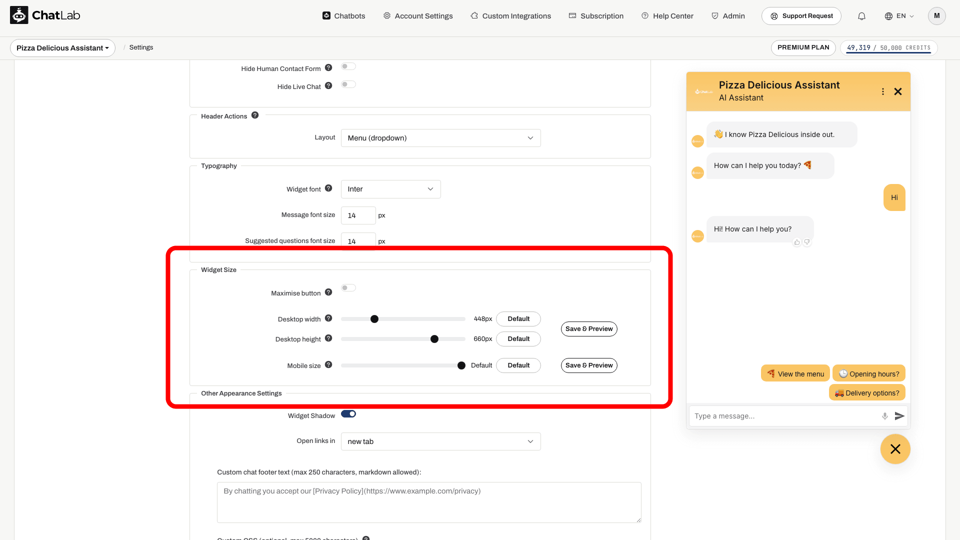
Dostosuj wielkość otwartego widgetu czatu na komputerach i urządzeniach mobilnych. Każdy suwak ma przycisk Domyślne (Default), który przywraca domyślne wymiary.
- Szerokość na komputerach (Desktop width) - szerokość widgetu w przeglądarkach na komputerach, w pikselach (330-800, domyślnie 448)
- Wysokość na komputerach (Desktop height) - wysokość widgetu w przeglądarkach na komputerach, w pikselach (300-770, domyślnie 660)
- Rozmiar na telefonach (Mobile size) - wielkość widgetu na urządzeniach mobilnych, jako procent ekranu (60-100%, domyślnie 100%)
Przy wartości domyślnej widget korzysta z wbudowanego, responsywnego skalowania ChatLab. Każda inna wartość ustawia stały rozmiar.
Na urządzeniach mobilnych wartość domyślna (100%) sprawia, że otwarty czat zajmuje cały ekran. Wybranie mniejszej wartości procentowej zmniejsza widget do tej części ekranu i wyśrodkowuje go w oknie przeglądarki, dzięki czemu odwiedzający nadal widzą stronę wokół czatu.
Obok suwaków znajdziesz dwa przyciski Zapisz i wyświetl podgląd (Save & Preview; wyróżnione poniżej) - jeden dla wierszy wersji komputerowej i jeden dla wersji mobilnej. Kliknięcie przycisku zapisuje niezapisane zmiany, a następnie otwiera czat w oknie podglądu z zastosowaniem Twoich aktualnych ustawień:
- Przycisk dla wersji komputerowej otwiera standardowe okno przeglądarki, dzięki czemu zobaczysz dokładny rozmiar na ekranie komputera.
- Przycisk dla wersji mobilnej otwiera kompaktowe okno podręczne (400 x 700), aby widget wyświetlił się w układzie mobilnym, co jest przydatne podczas dostosowywania suwaka Rozmiar na telefonach (Mobile size) z poziomu komputera.
Przycisk maksymalizacji (tryb bocznego panelu / Maximise Button, Drawer Mode)
Tryb bocznego panelu (Drawer mode) pozwala odwiedzającemu przełączyć czat z pływającego okna w panel o pełnej wysokości zadokowany przy krawędzi ekranu, z Twoją stroną wciąż widoczną obok. Sprawdza się to w rozmowach, które użytkownik prowadzi podczas czytania strony - przy długich odpowiedziach, porównywaniu produktów, formularzach czy innych treściach z dużą ilością tekstu.
Włącz opcję Przycisk maksymalizacji (Maximise button) w sekcji Rozmiar widgetu (Widget Size), a w nagłówku czatu pojawi się odpowiedni przycisk; odwiedzający sam decyduje, czy z niego skorzystać. Jego wybór jest zapamiętywany na resztę sesji przeglądania.
- Panel ma szerokość połowy okna przeglądarki (maksymalnie 720 px) i zawsze pełną wysokość. Dokuje się po tej samej stronie co Twój launcher, więc widget umieszczony po lewej stronie otworzy boczny panel po lewej.
- Ustawienia Szerokość na komputerach (Desktop width) i Wysokość na komputerach (Desktop height) nie mają tutaj zastosowania - określają one wyłącznie rozmiar standardowego okna pływającego.
- Przycisk wyświetla się tylko na ekranach komputerów o szerokości co najmniej 1200 px, z obsługą myszy. Na telefonach i tabletach nie pojawia się nigdy, ponieważ czat i tak wypełnia tam cały ekran. Jeśli odwiedzający zmniejszy okno przeglądarki poniżej tej szerokości, panel boczny zwinie się z powrotem do normalnego okna.
- Launcher jest ukryty, gdy panel boczny pozostaje otwarty; odwiedzający może zamknąć go z poziomu nagłówka lub opuścić tryb panelu bocznego tym samym przyciskiem.
Tryb bocznego panelu jest domyślnie wyłączony, więc dla Twoich odwiedzających nic się nie zmieni, dopóki go nie włączysz.

Pozostałe ustawienia wyglądu (Other Appearance Settings)
- Widget Shadow - włącz lub wyłącz cień wokół kontenera widgetu czatu
- Open links in - wybierz, czy linki w wiadomościach czatu mają otwierać się w nowej karcie (new tab), czy w tej samej karcie (same tab)
W nagłówku czatu na komputerach wyświetlany jest również przycisk zamknięcia (X), dzięki czemu odwiedzający mogą zwinąć czat z powrotem do przycisku uruchamiającego bez przeładowywania strony. Przycisk zamknięcia pozostaje ukryty, gdy czat jest osadzony jako iframe lub w trybie pełnoekranowym.
Własna stopka czatu (Custom Chat Footer)
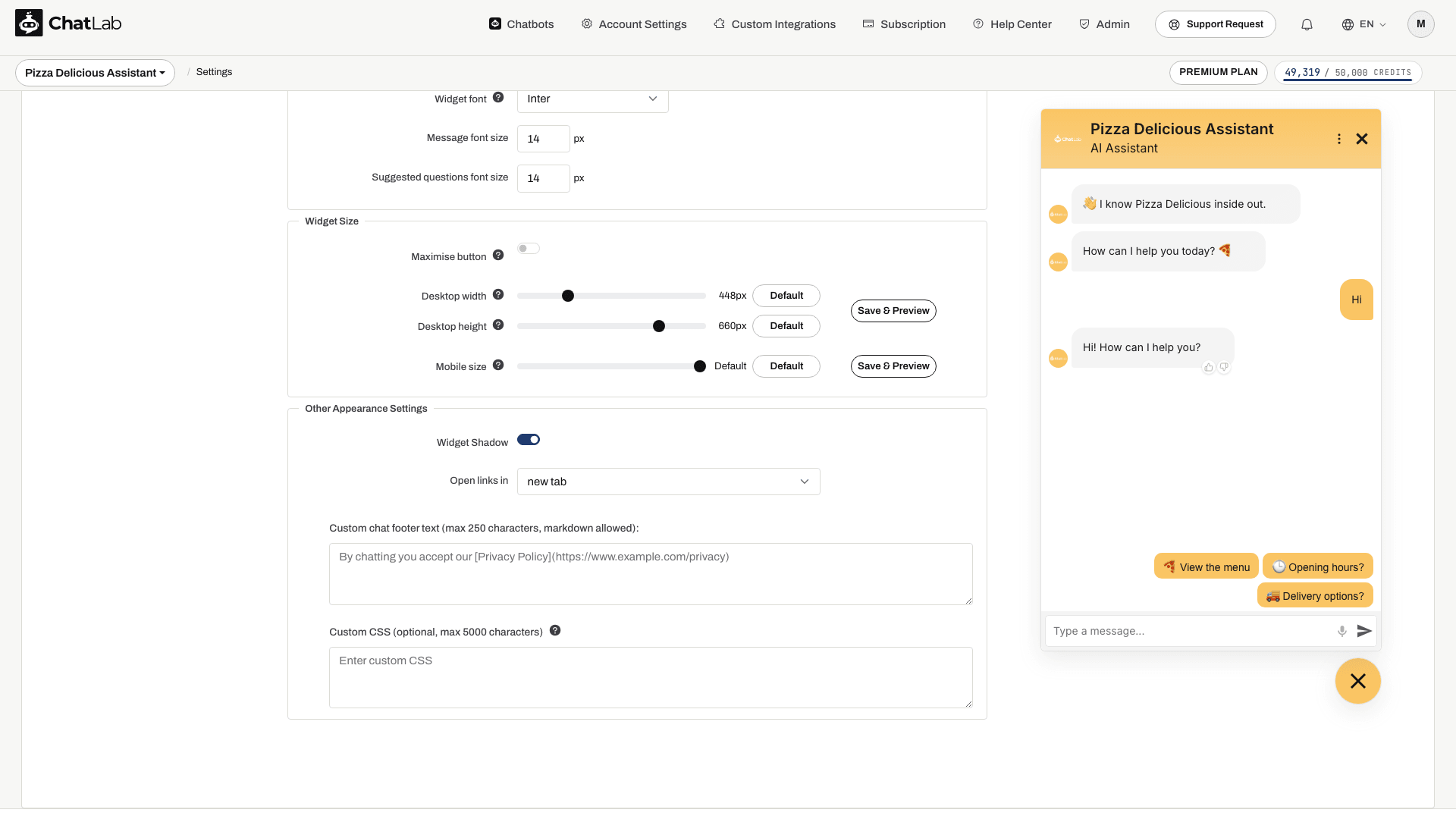
Dodaj własny tekst wyświetlany na dole widgetu czatu (maksymalnie 250 znaków). Format Markdown jest obsługiwany i umożliwia wstawianie linków. Typowym zastosowaniem jest podlinkowanie polityki prywatności lub regulaminu.
Przykładowy kod Markdown:
By chatting you accept our [Privacy Policy](https://www.example.com)
Własny CSS (Custom CSS)
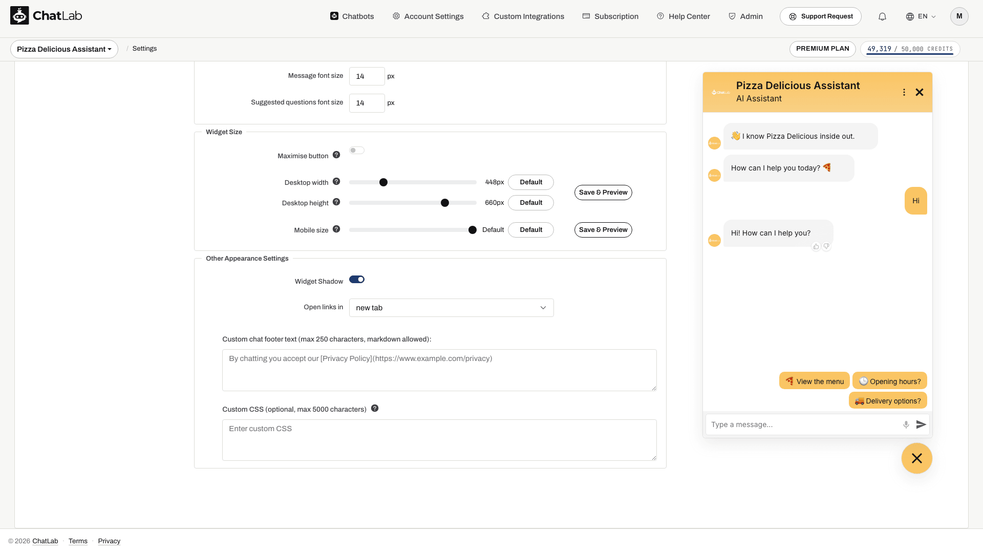
Dodaj własne style CSS, aby jeszcze dokładniej dostosować wygląd swojego widgetu czatu (maksymalnie 5000 znaków):
Powiązane artykuły
Zmiany zapisują się automatycznie. Poczekaj na komunikat Saved (Zapisano), a następnie sprawdź zakładkę Overview (Przegląd) oraz osadzony widget na komputerze i urządzeniu mobilnym. Podgląd w ustawieniach pokazuje samo okno czatu - rozmieszczenie przycisku uruchamiającego (launchera) oraz reguły automatycznego otwierania na poziomie strony warto sprawdzić również bezpośrednio na Twojej stronie osadzenie widgetu na stronie.
- Jak utworzyć swojego pierwszego chatbota
- Ustawienia konwersacji - stwórz wiadomość powitalną i sugerowane pytania
- Ekran powitalny (Welcome Screen) - pełnoekranowy układ powitalny i jego warianty widoczne dla odwiedzających
- Niestandardowe formularze - zbieraj dane od odwiedzających bezpośrednio na czacie
- Zbieranie leadów